Hi, I’m Kim.
I design smart, scalable interfaces—and sometimes I code them, too. I build clear systems, beautiful details, and make the complex feel simple. Give me a messy problem and I’ll turn it into something that makes sense.
I’m a hands-on maker and I lead teams by building with them. I thrive on projects where I’m able to establish a strategy for a big website or product, create a vision for the future, and propel the work forward through build.
I’m as happy translating nuanced ideas into scalable design solutions as I am wiring up a content management system.
-
Upstatement
Principal Designer
2016 - Present / 10 years
-
IDEO
Interaction Design Lead
2013 - 2016 / 3 years
-
MullenLowe
Senior Designer
2012 - 2013 / 1 year
-
The Barbarian Group
Interaction Designer
2006 - 2012 / 6 years
-
Rochester Institute of Technology
BFA, New Media Design & Imaging
2002 - 2006 / 4 years
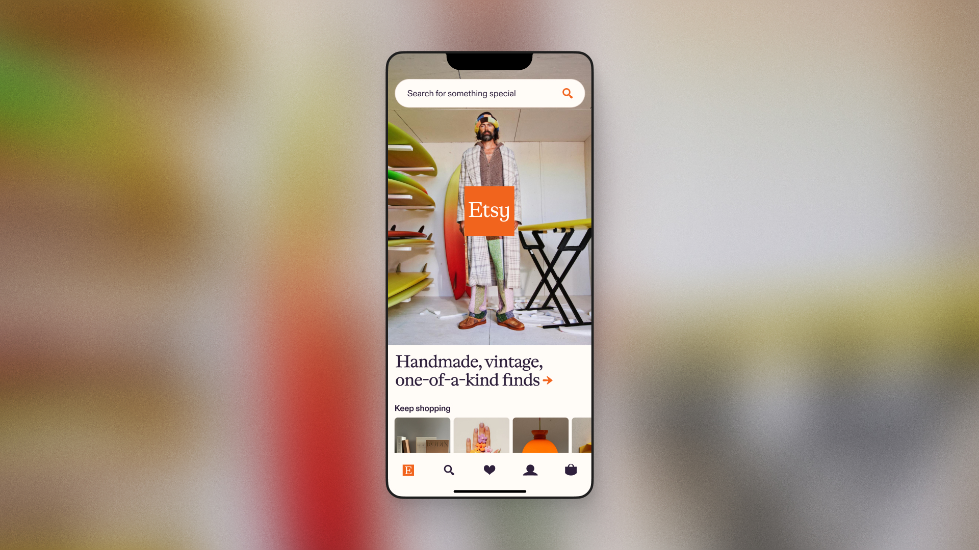
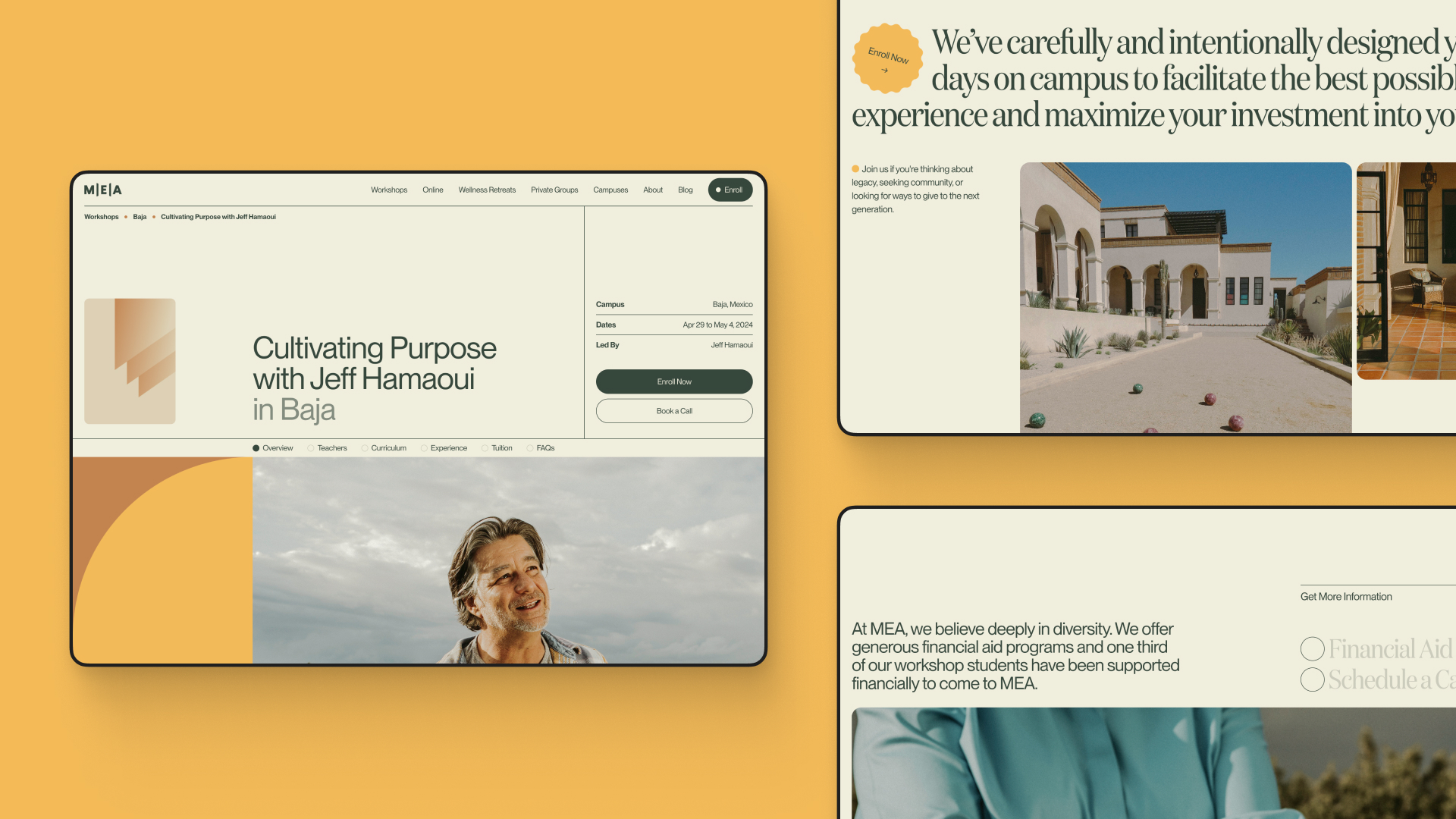
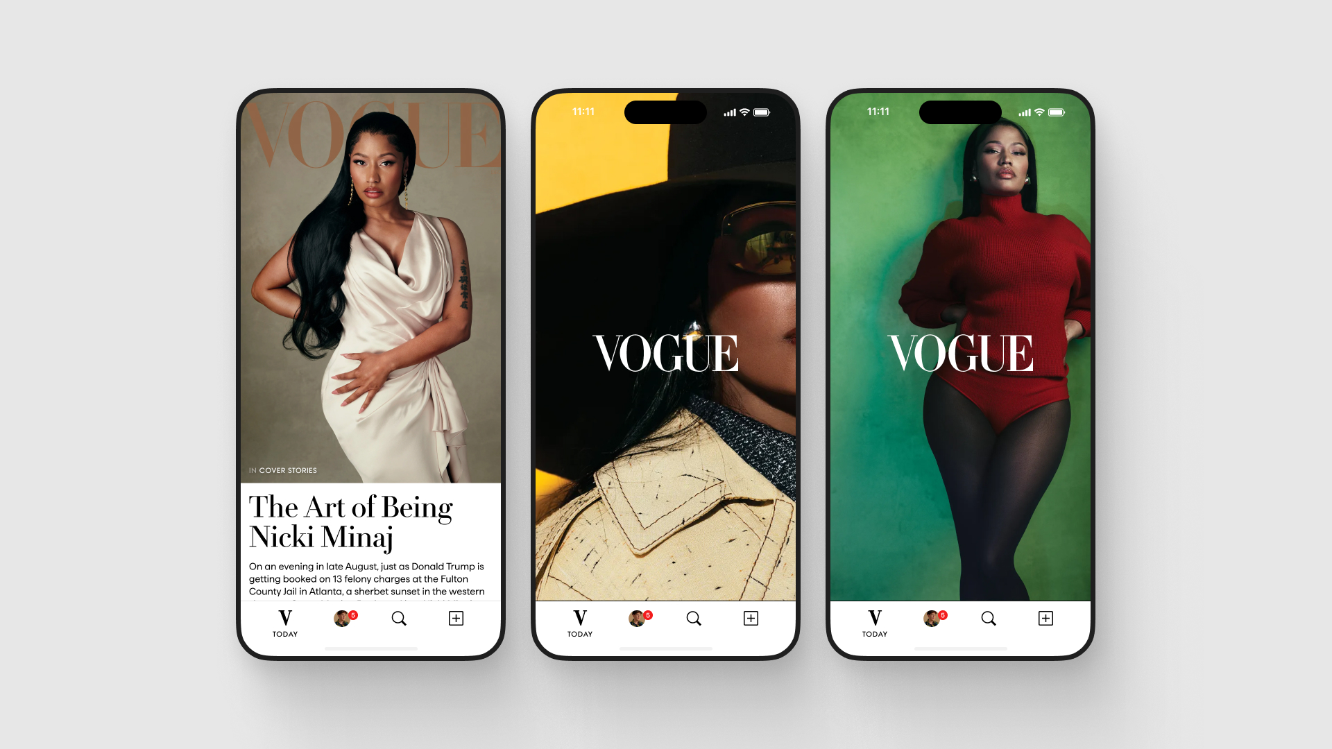
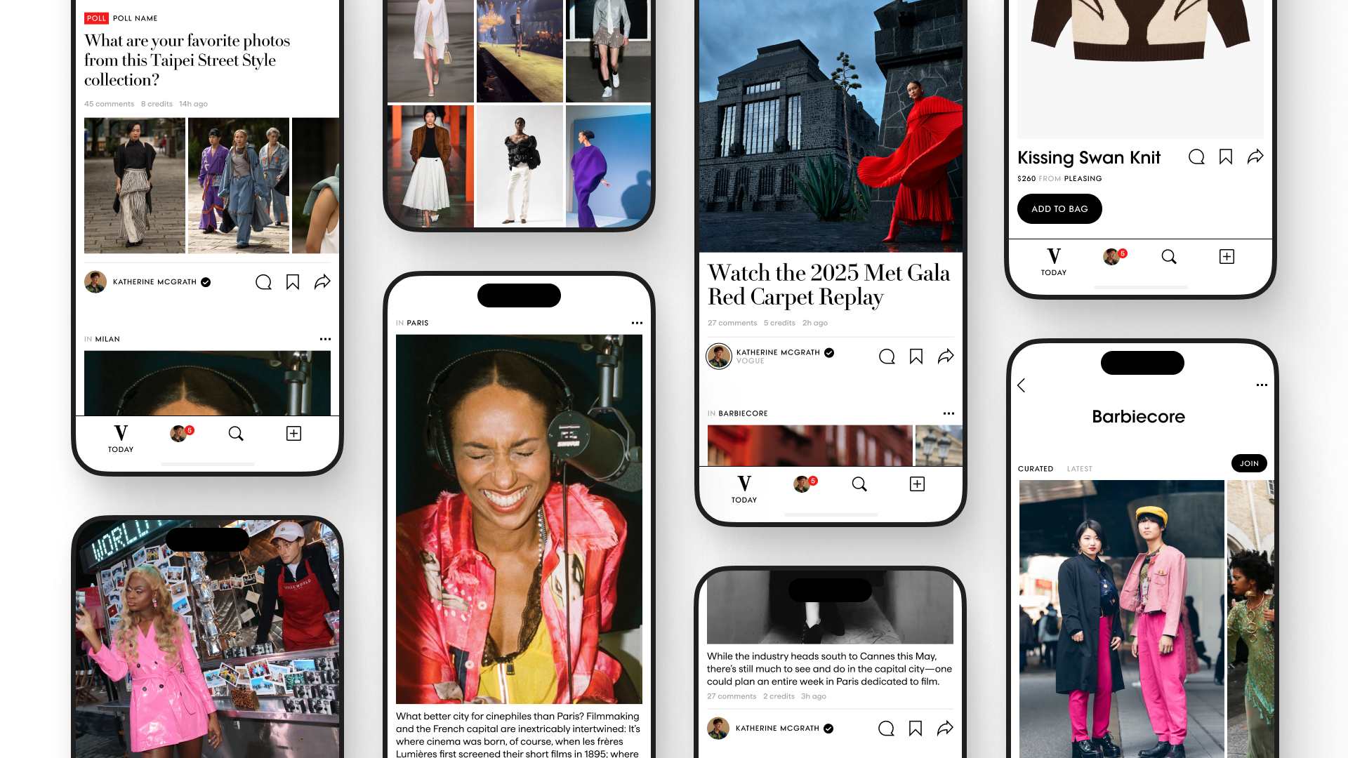
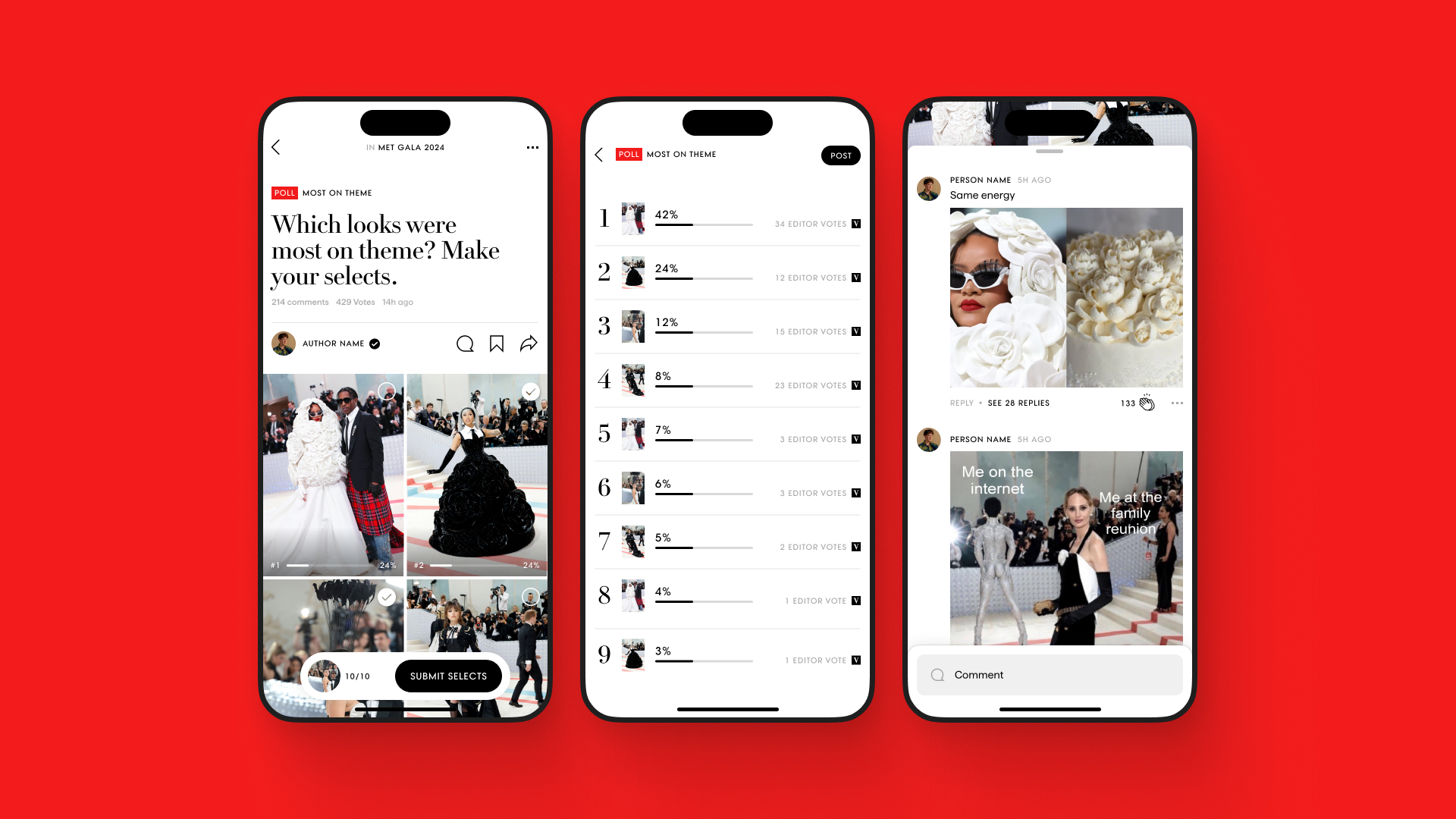
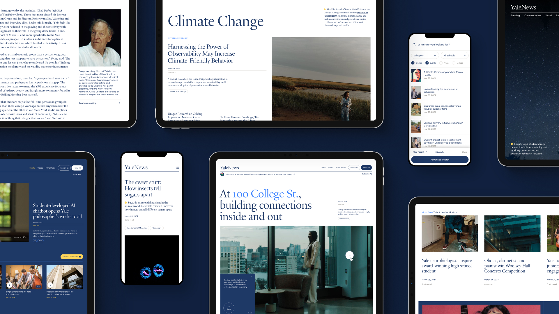
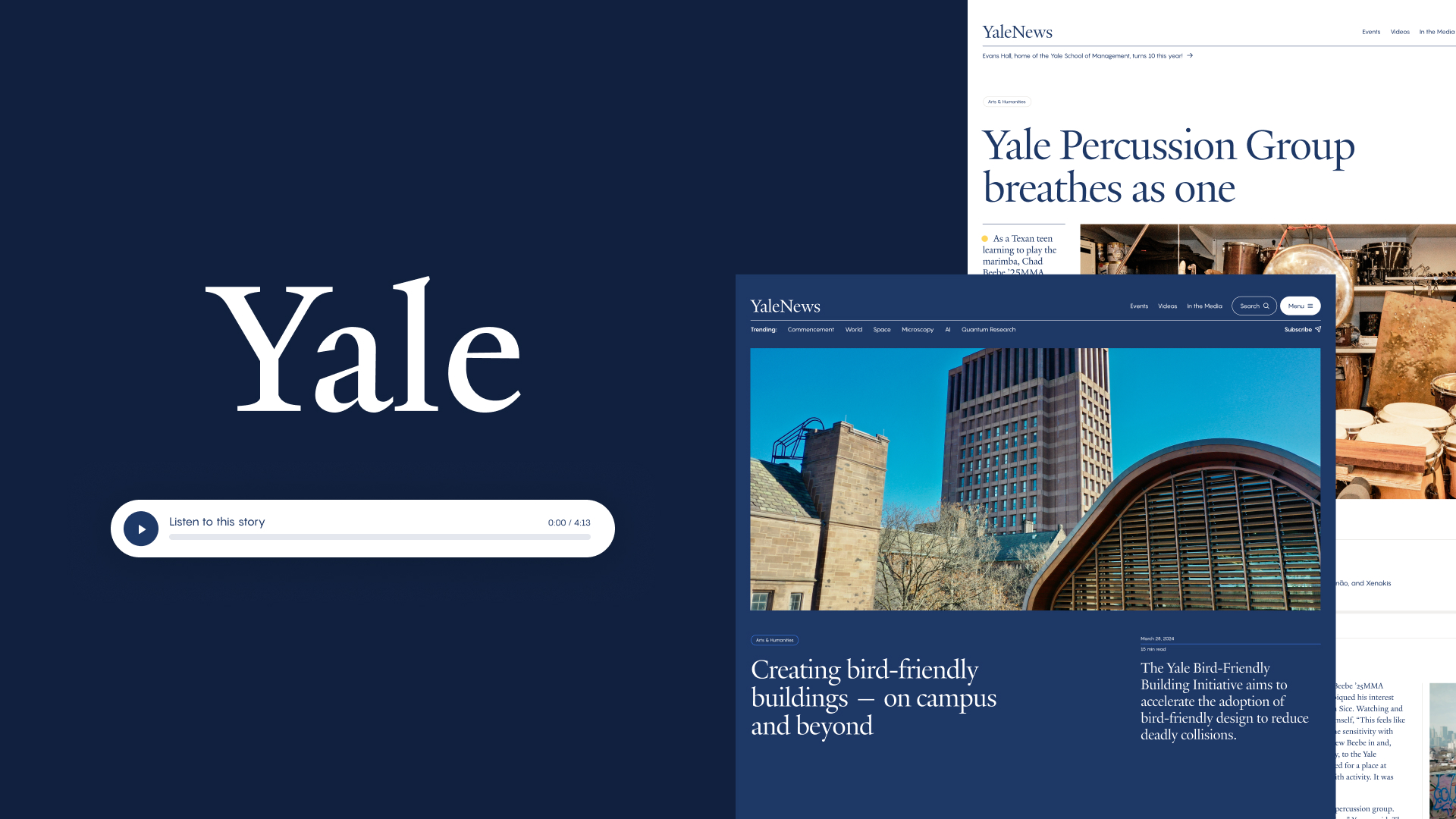
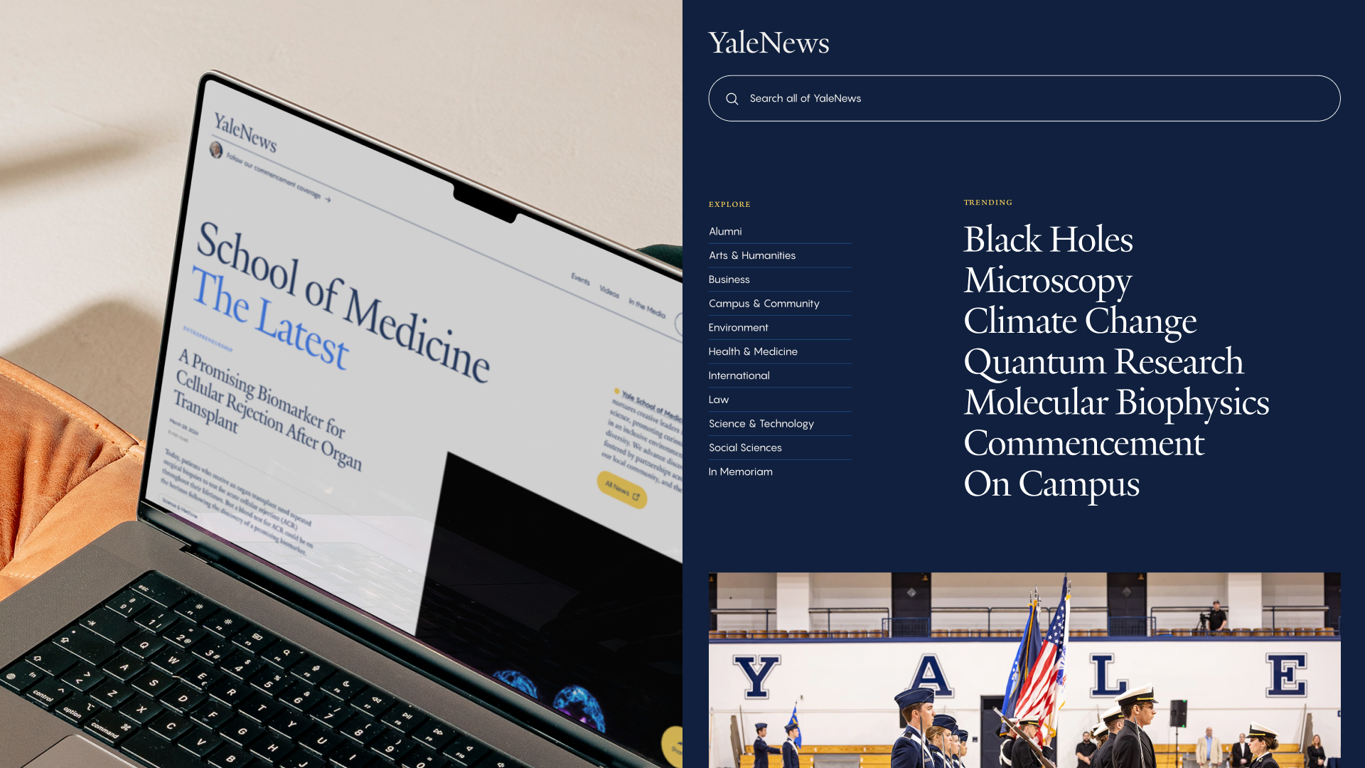
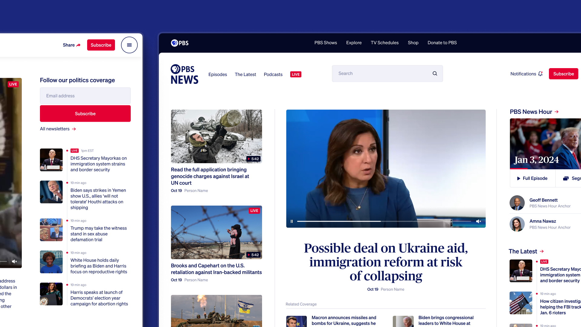
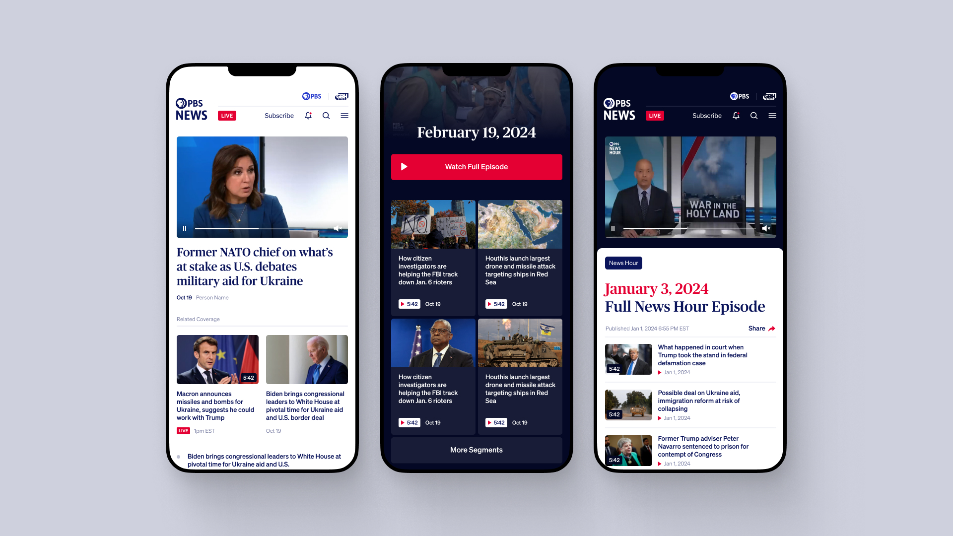
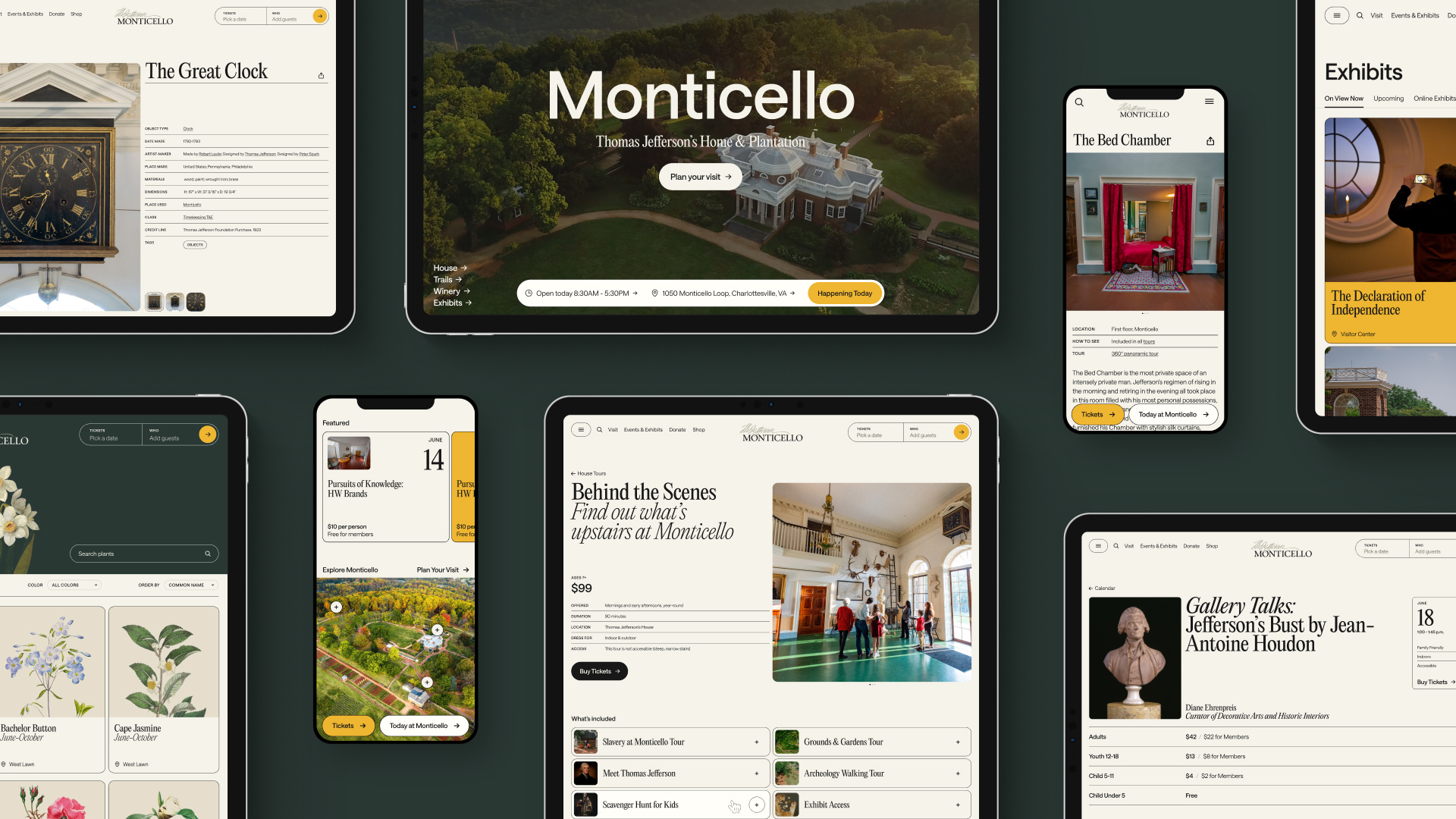
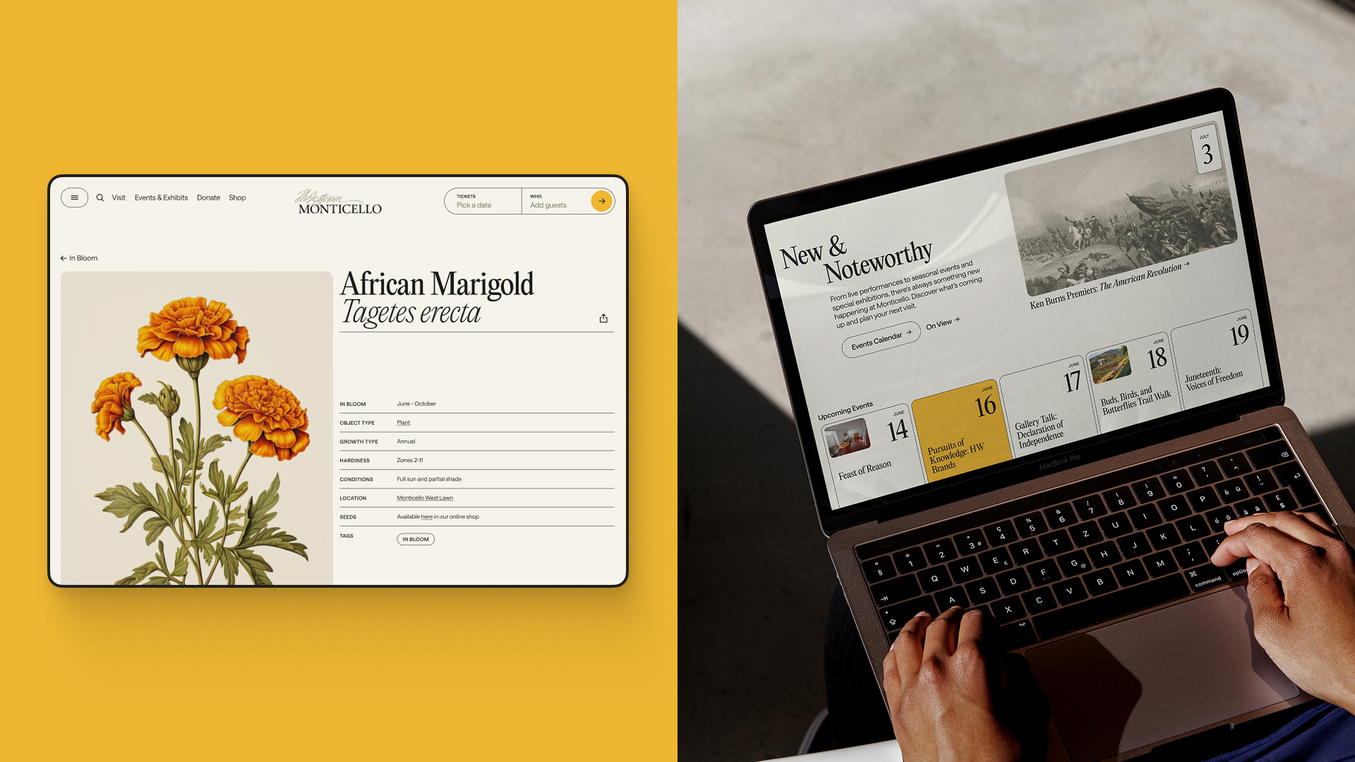
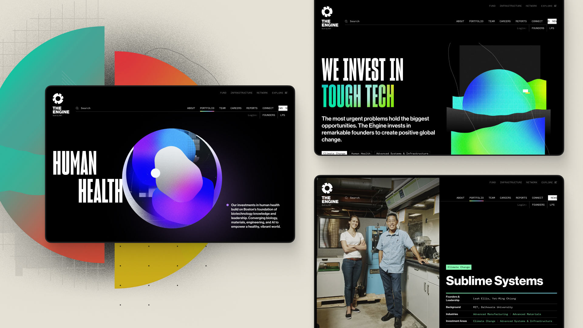
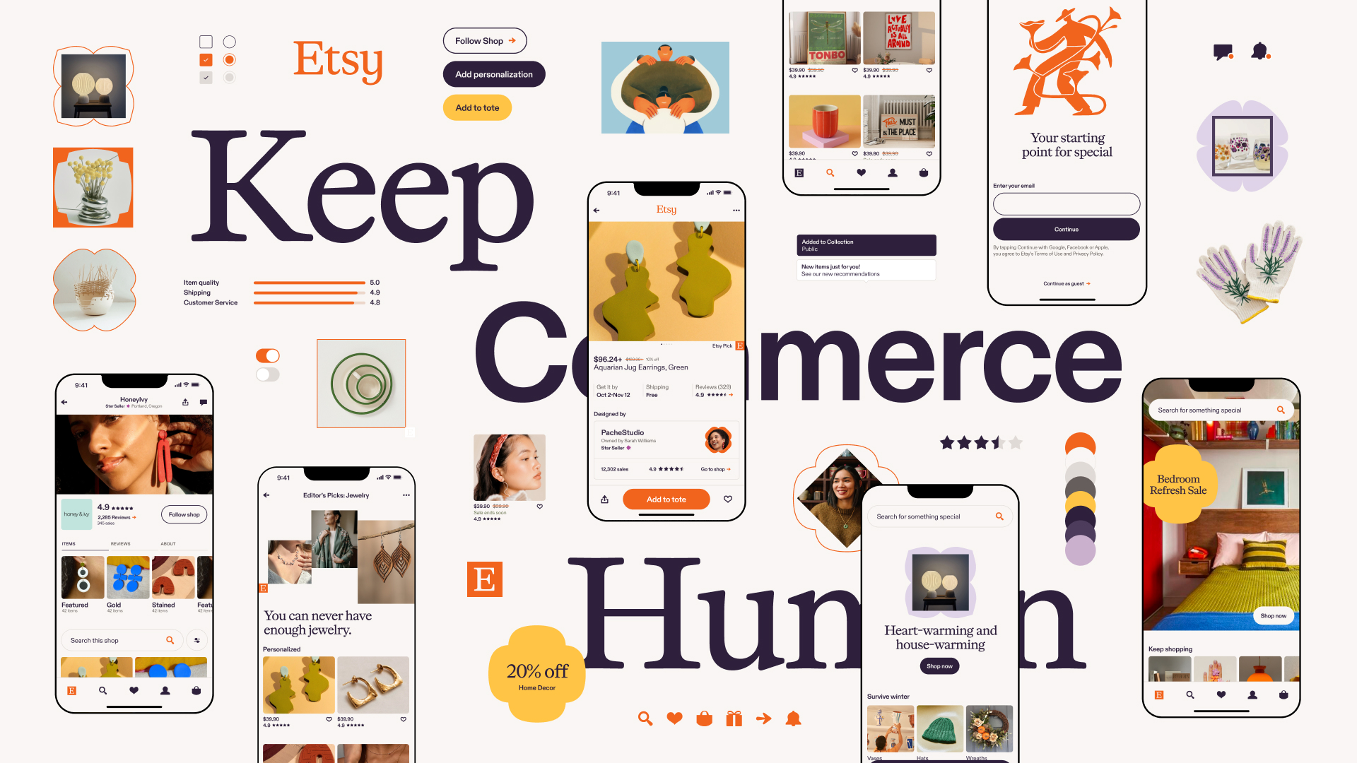
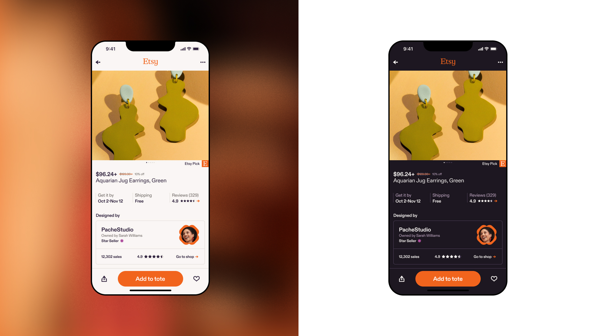
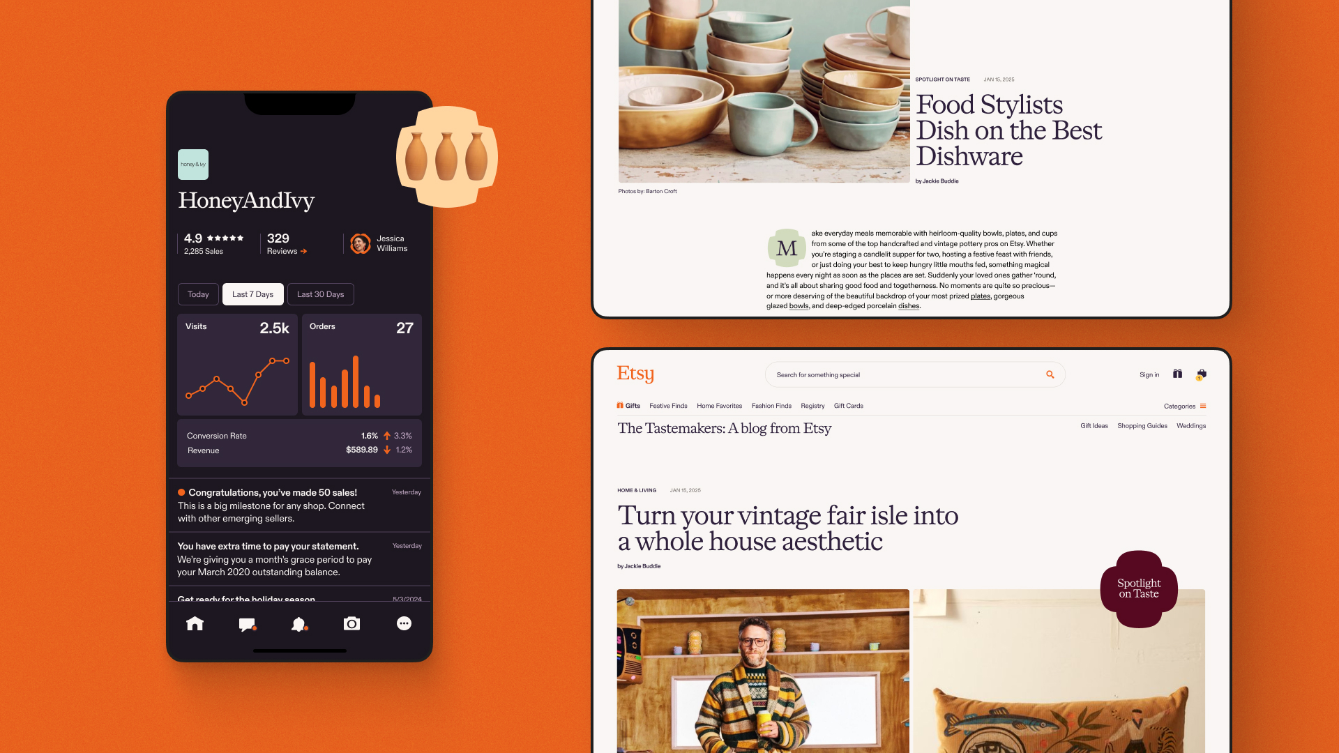
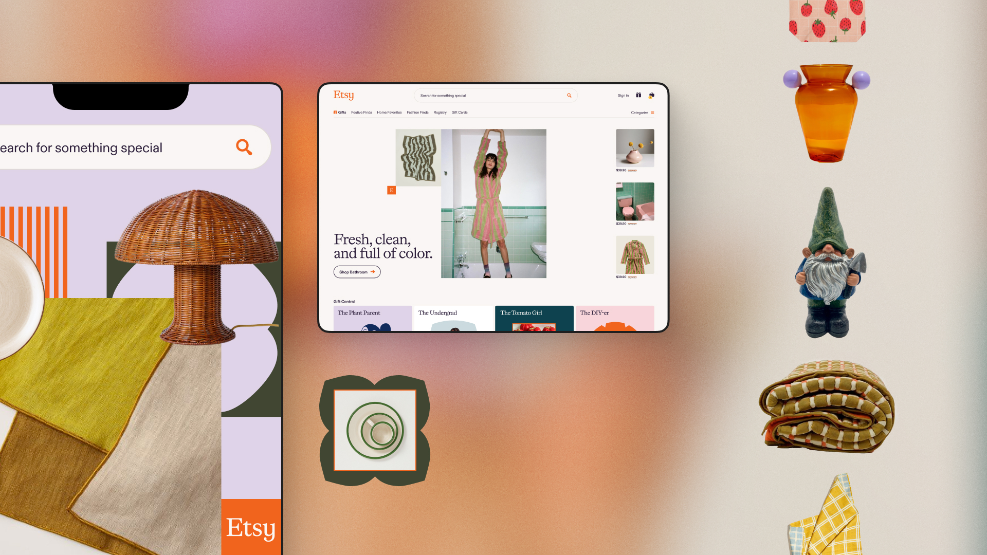
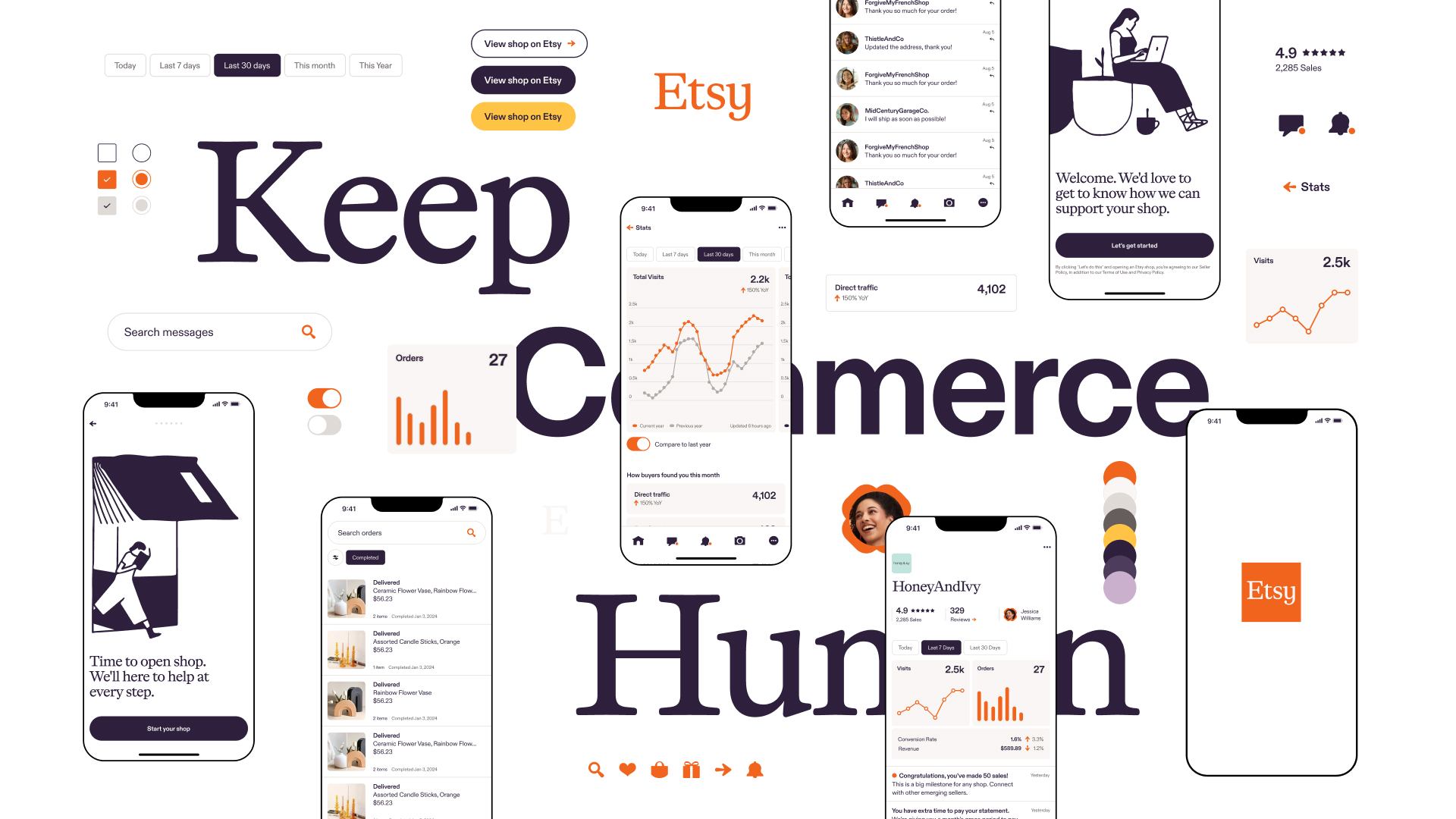
Etsy
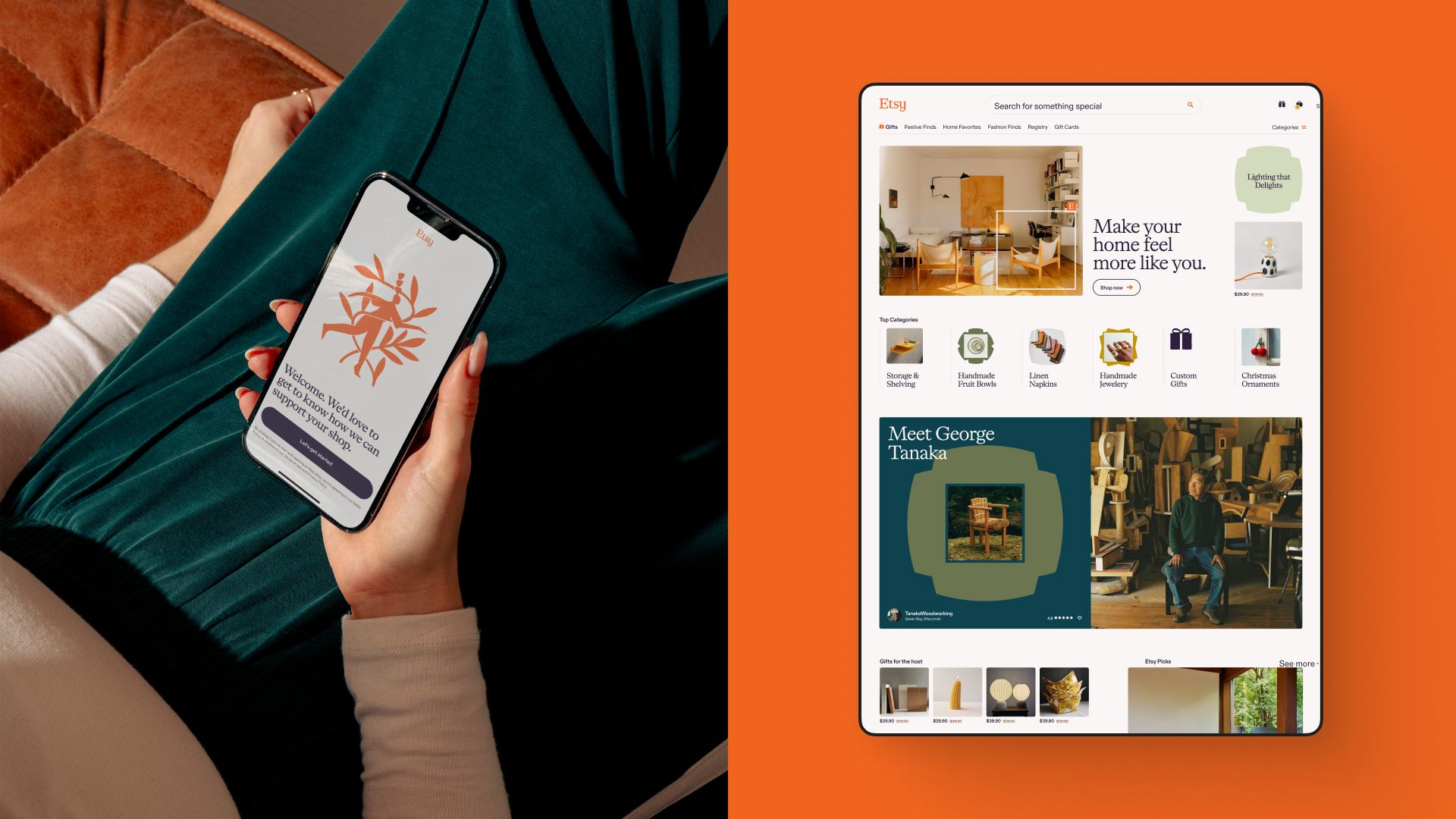
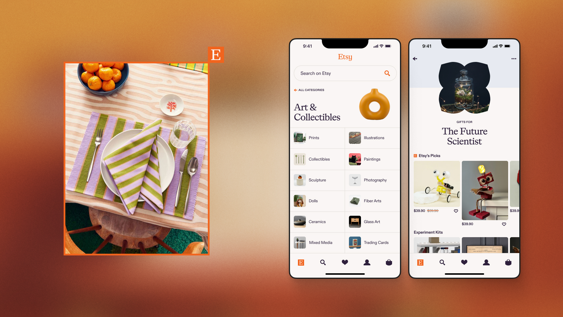
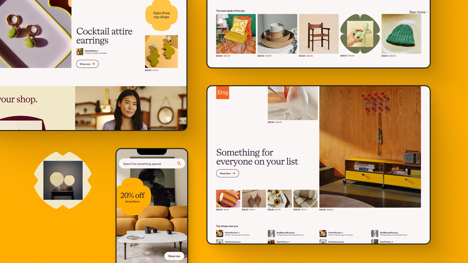
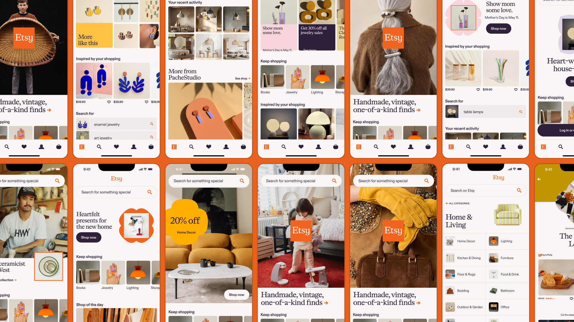
Context
Etsy was eager to evolve beyond its niche reputation and become a go-to destination for the everyday shopper. To shift that perception, Etsy partnered with SYLVAIN’s team of strategists and designers to refresh their brand — and translate it seamlessly across their most visible platforms: etsy.com, their buyer app, and their seller app.
My role
As the sole product designer embedded within a broader team of brand designers, strategists, writers, and motion leads, I was responsible for translating brand direction into thoughtful, usable digital experiences. I bridged the gap between brand and product — ensuring the visual language, messaging, and motion principles scaled beautifully across screens. My work ensured that the evolving brand identity wasn’t just expressive, but also highly usable, scalable, and grounded in best-in-class digital design practices.
Outcome
Our work sparked overdue conversations inside Etsy’s product organization—surfacing tensions, clarifying priorities, and catalyzing alignment between the brand and product teams. The final deliverables weren’t just visually compelling; they offered a blueprint for cross-functional collaboration and a more unified customer experience. While Etsy will carry the work forward, we left behind a toolkit and design approach that created real momentum. In our last meeting, they said, “You gave us a future.”
What I did
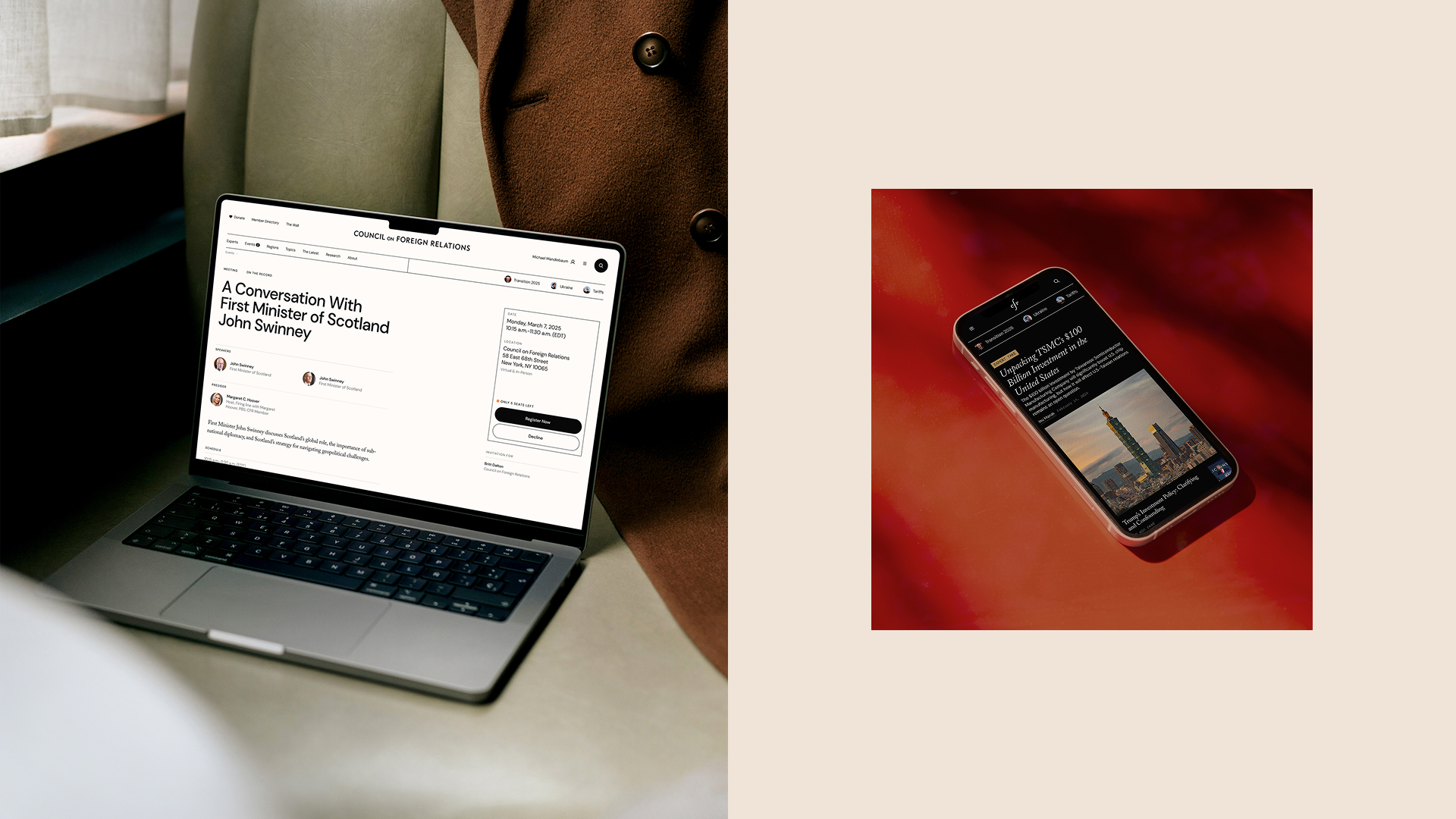
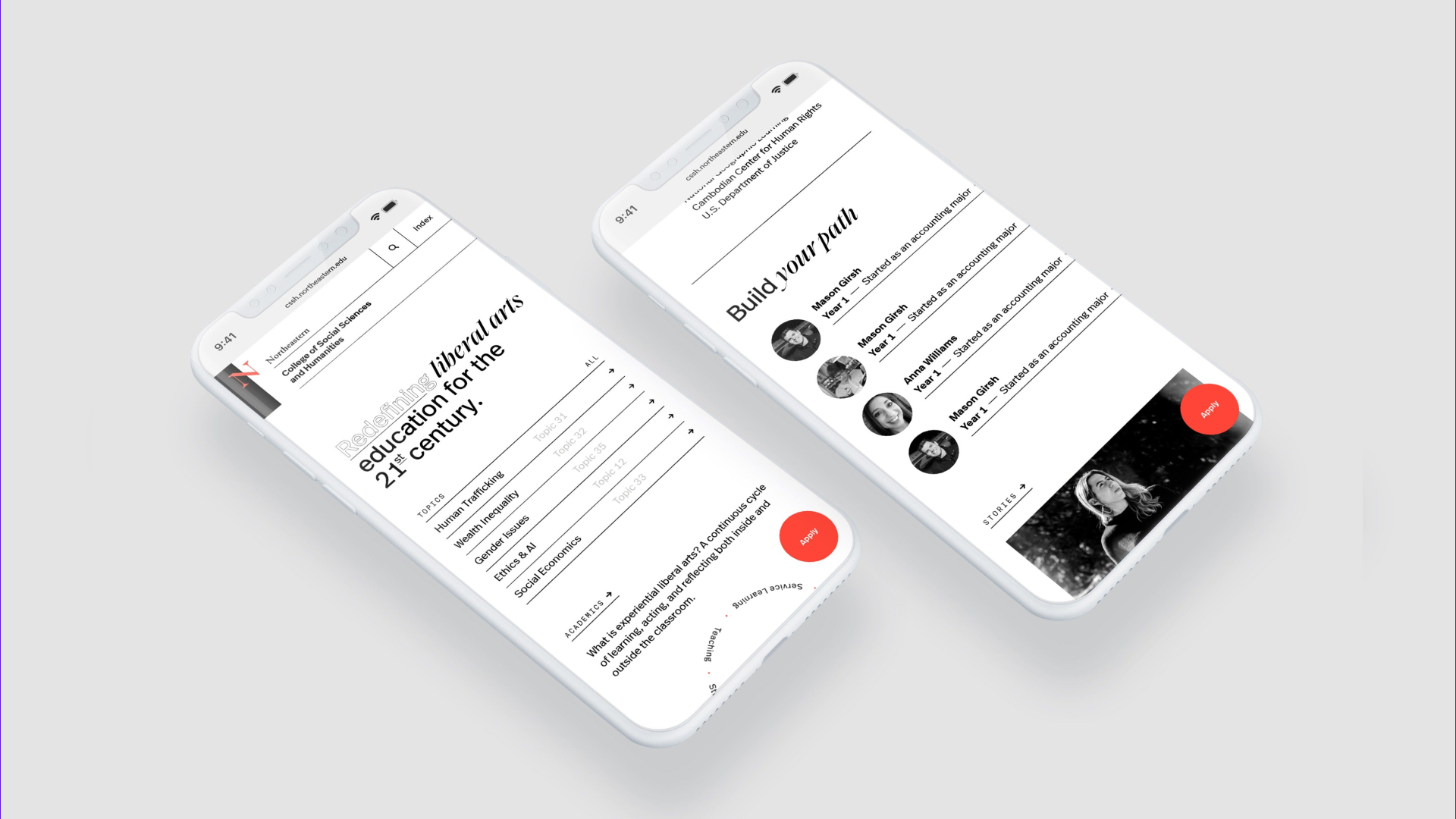
Council on Foreign Relations
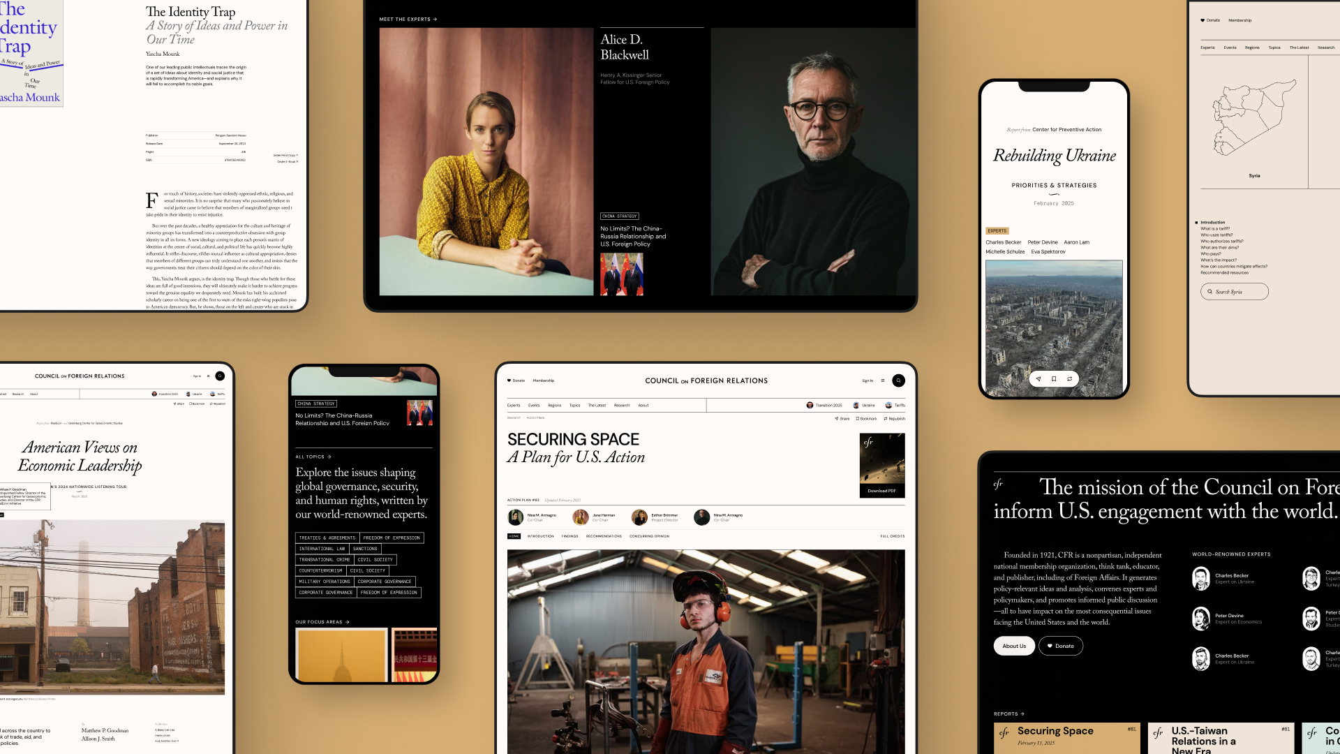
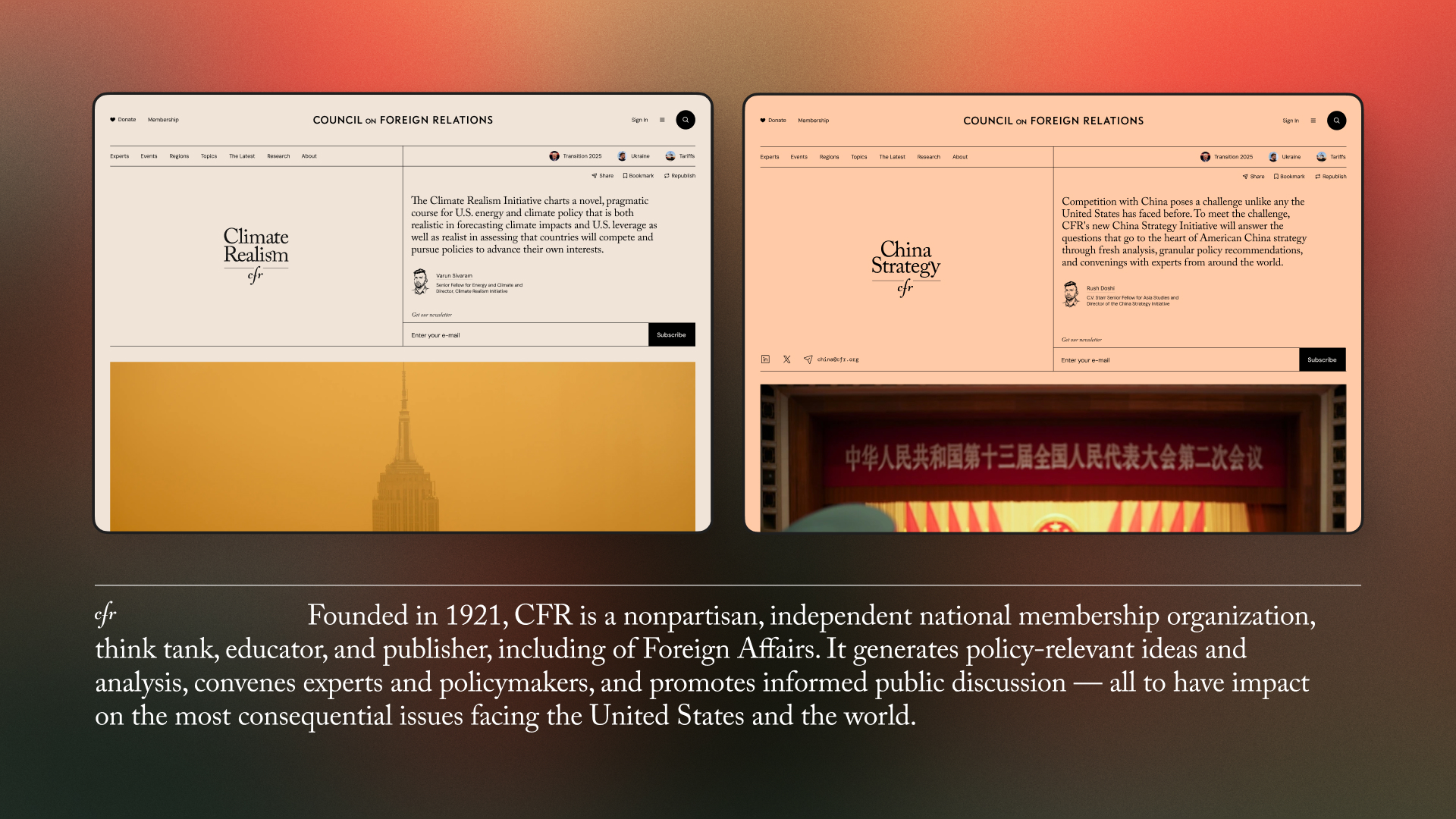
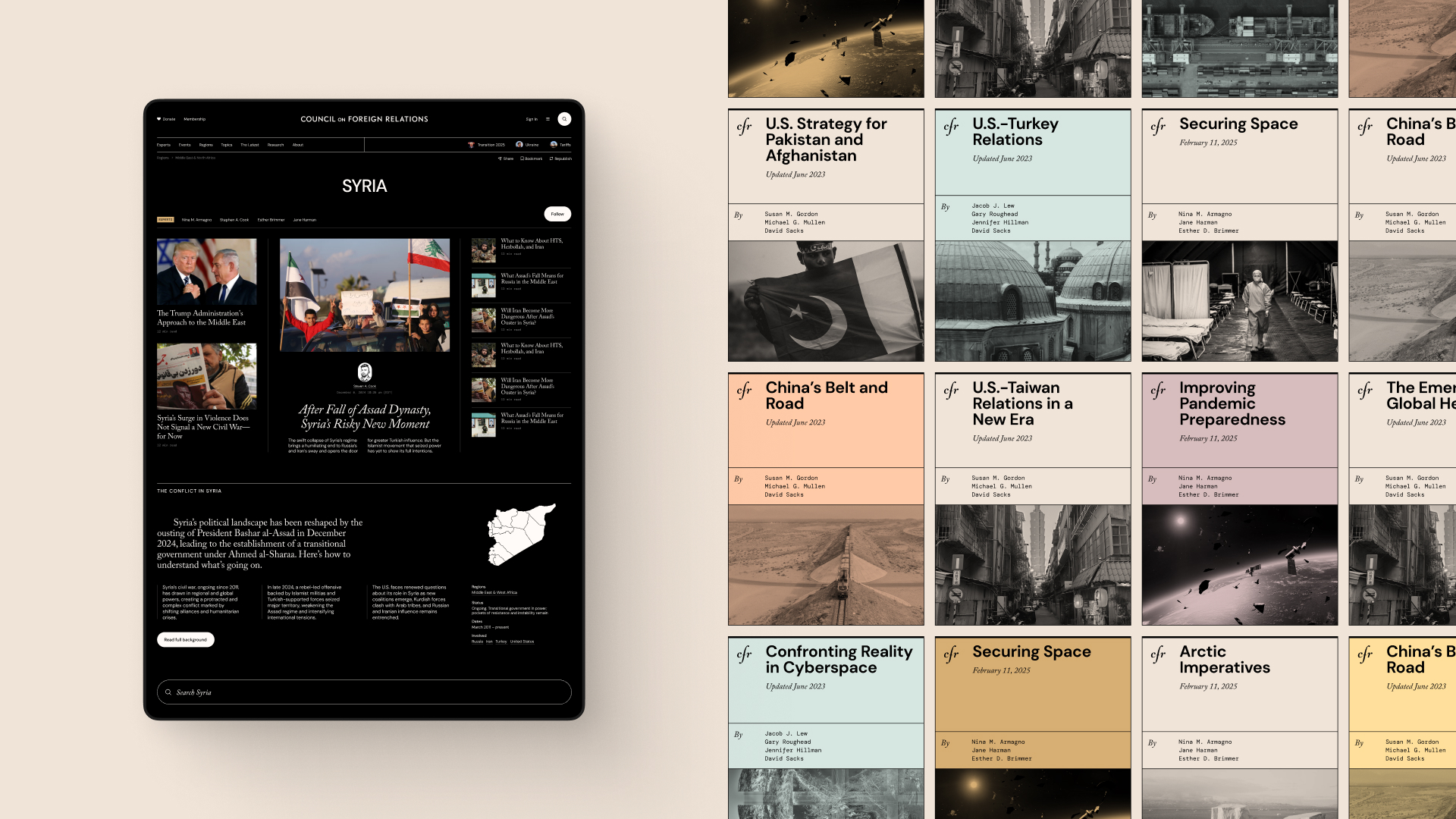
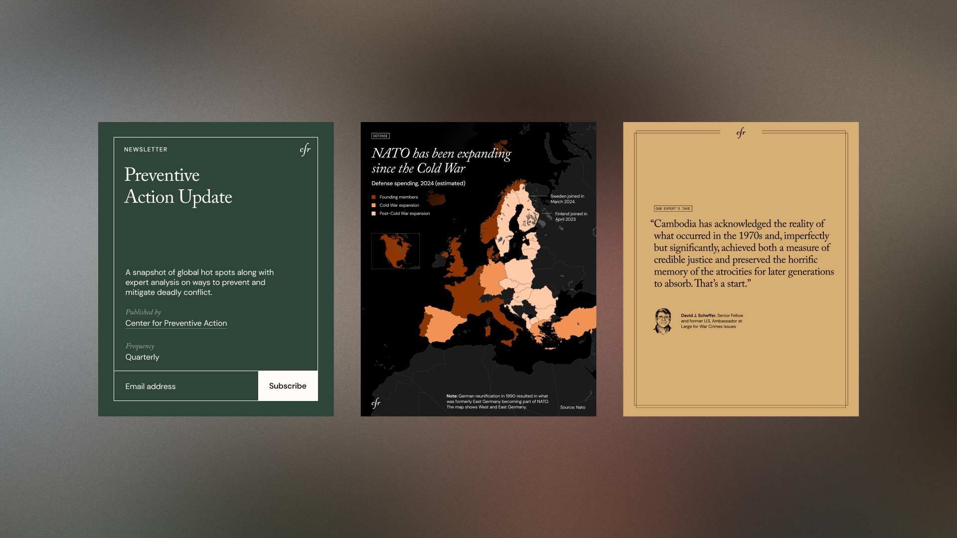
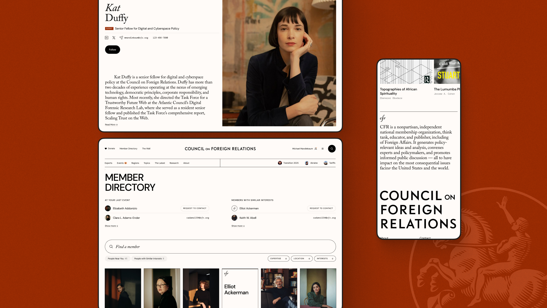
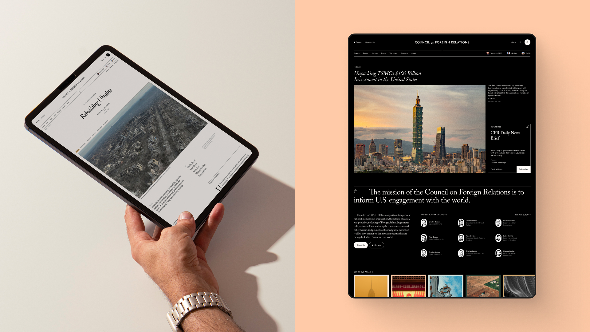
Context
CFR is an independent, nonpartisan membership organization, think tank, and publisher dedicated to improving understanding of U.S. foreign policy and international affairs for policymakers, academics, and journalists. They wanted to modernize their website to better serve their 5,000 prestigious members and the public. Specifically, they told us, “We are high-brow and fabulous and we should look like it.”
My role
I led the design effort during the Vision phase. I worked with Upstatement’s strategists and CFR’s design and product teams to develop a new look and strategy for the site. My goal was to build consensus and align many stakeholders, while also creating a digital identity that was true to the organization’s mission and values.
Outcome
The site is still in development, but the foundation I laid will fuel CFR’s roadmap for years. I’m particularly proud of my push to make the member portal site and the main cfr.org site one platform with a logged in/logged out experience. It was the best way to make the site more valuable to members and makes space for CFR to create new value as the site evolves.
What I did
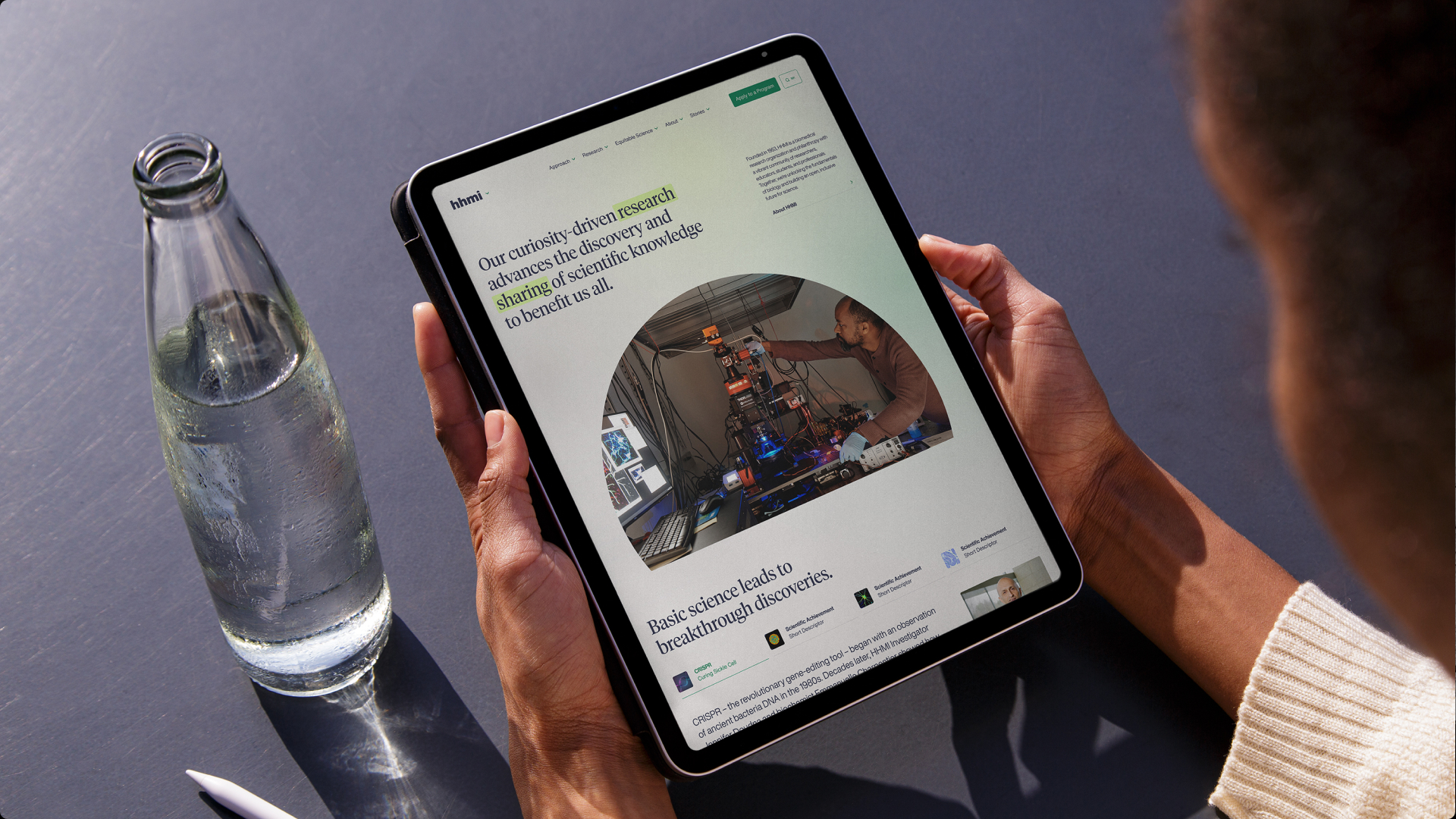
Howard Hughes Medical Institute
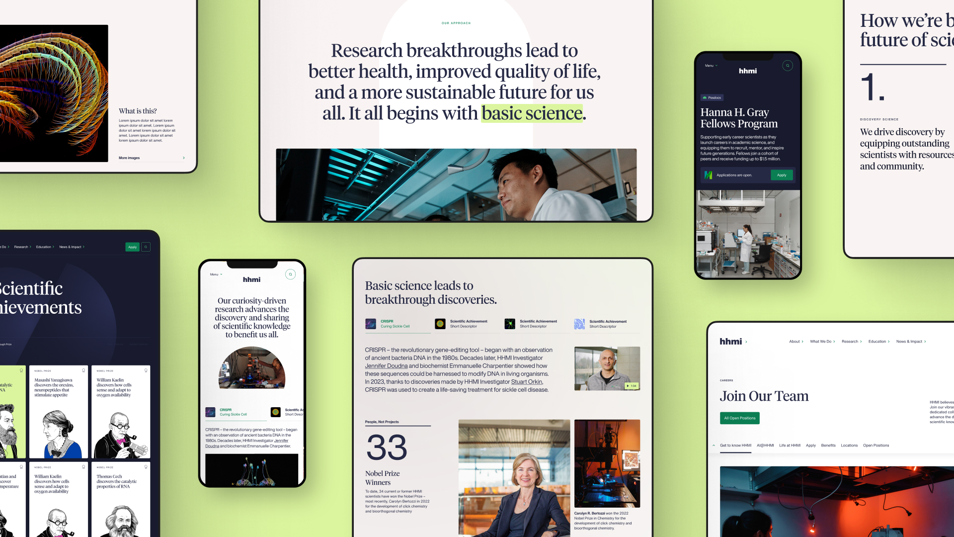
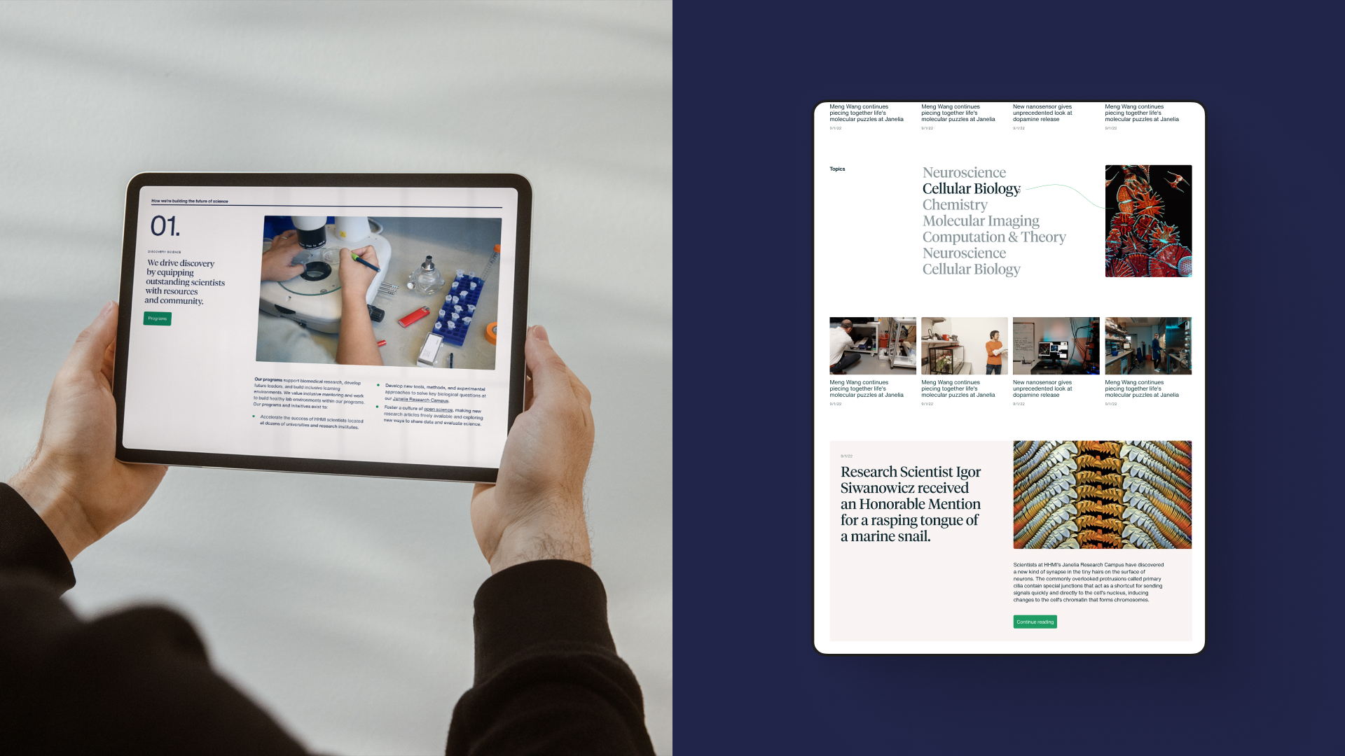
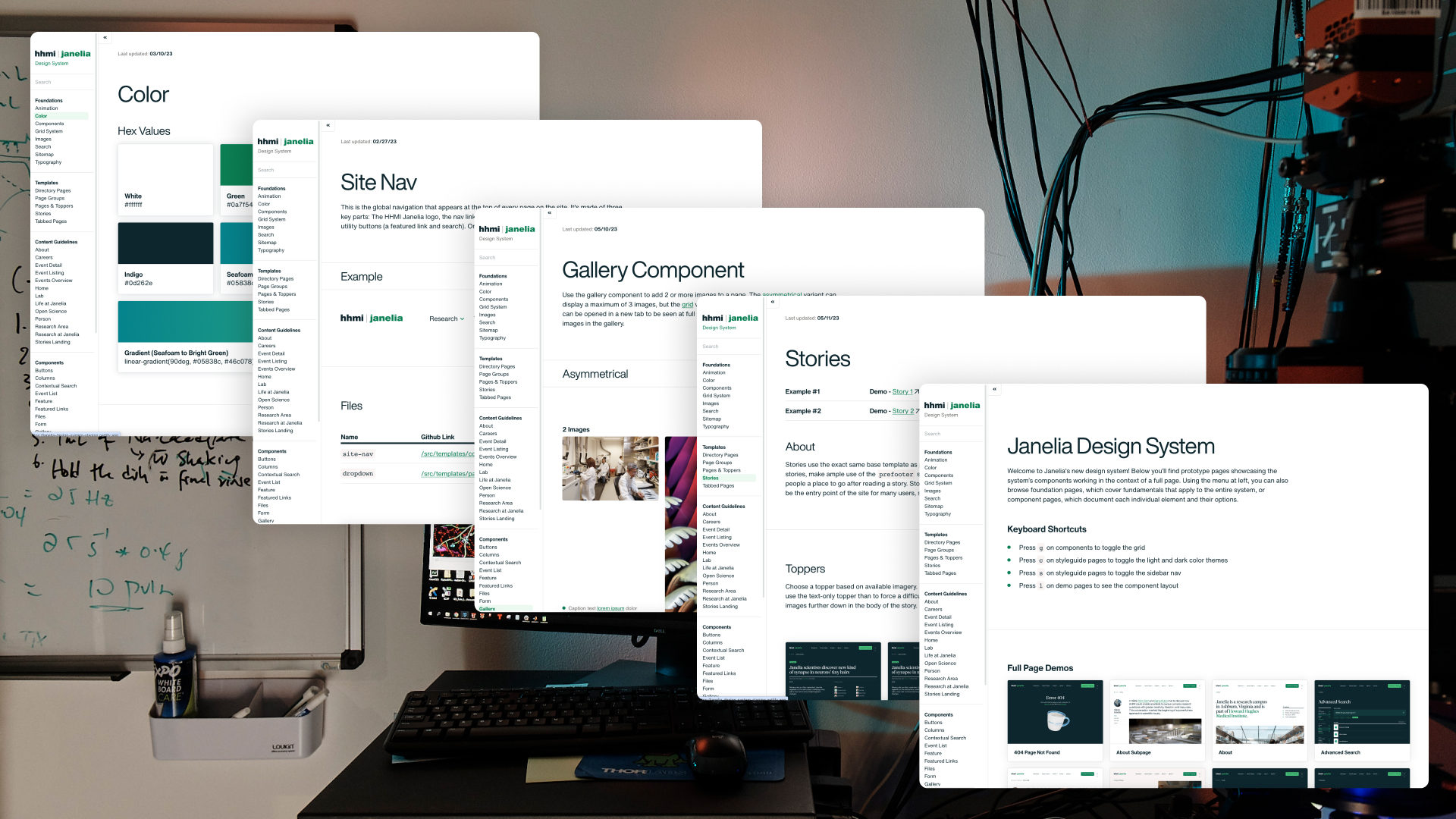
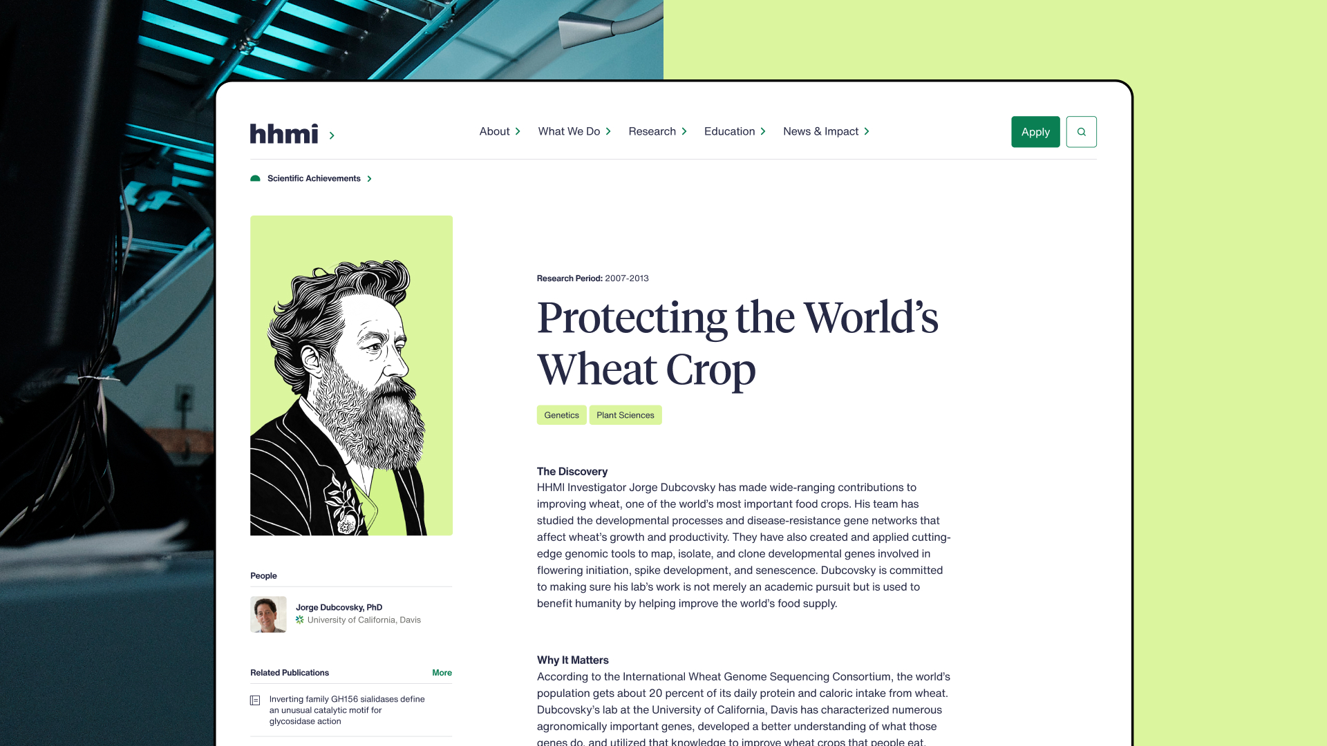
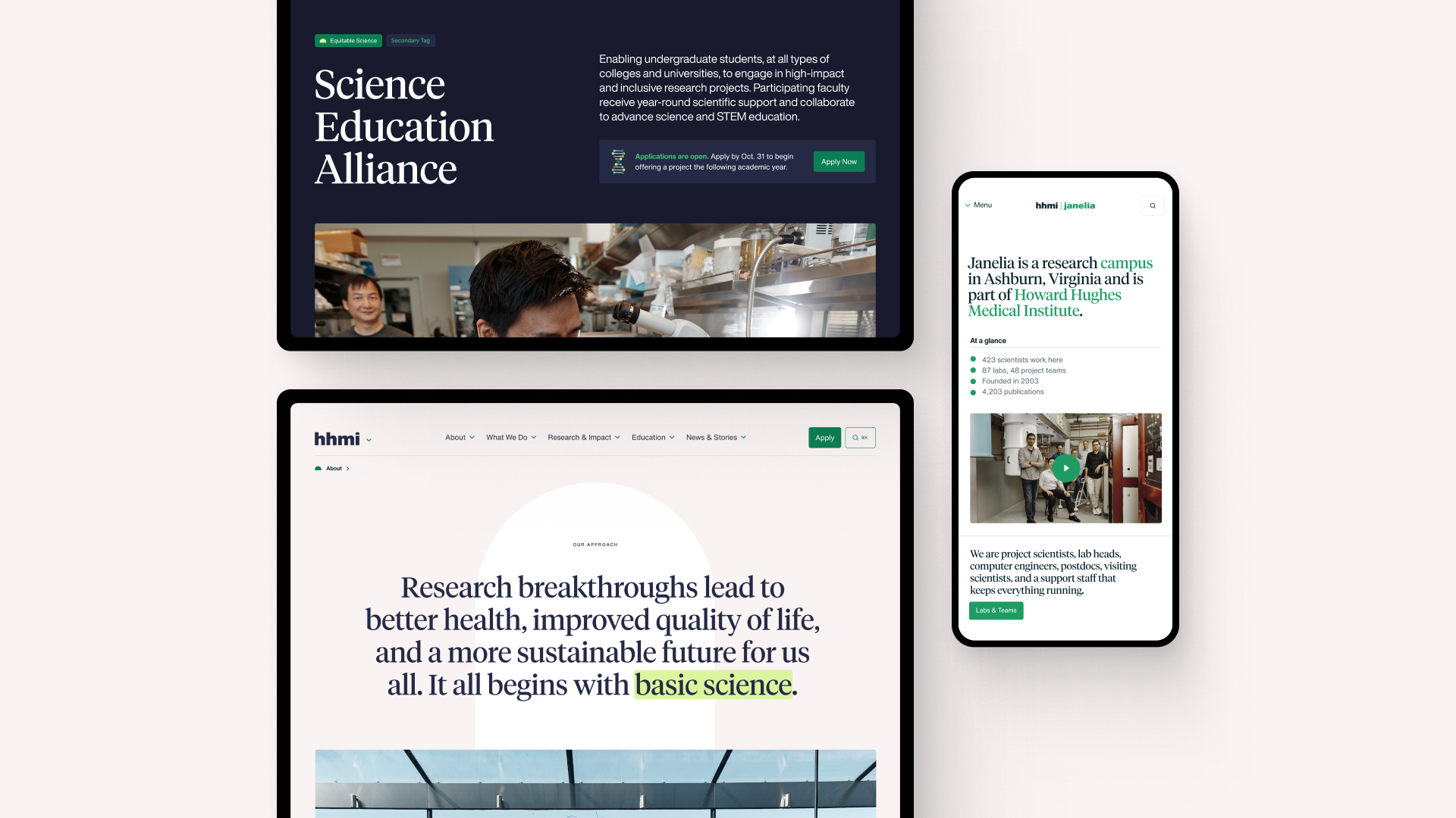
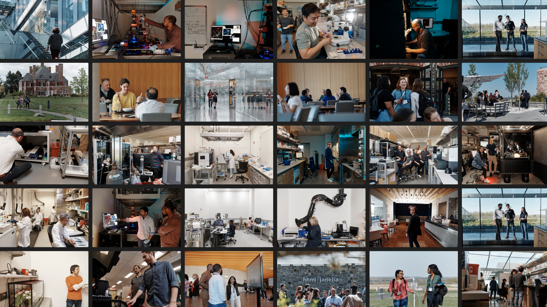
Context
HHMI is the second-wealthiest philanthropic organization in the U.S., but you’ve probably never heard of them. They fund biomedical research and free scientists from the grant-grind, but like many large organizations, their site was a reflection of internal structures, not user needs.
My role
I developed a unified design system for HHMI and its research campus, Janelia, to create a cohesive visual identity. This included building a bespoke frontend design system tailored for seamless implementation by their Drupal engineering team. I also prioritized the most impactful components to build and demonstrated their application on key landing pages, ensuring clarity and usability.
Outcome
HHMI’s comms team has the tools to more effectively tell their story to the outside world and their engineering team has an entire static frontend to use as their source of truth for functional and visual requirements.
What I did
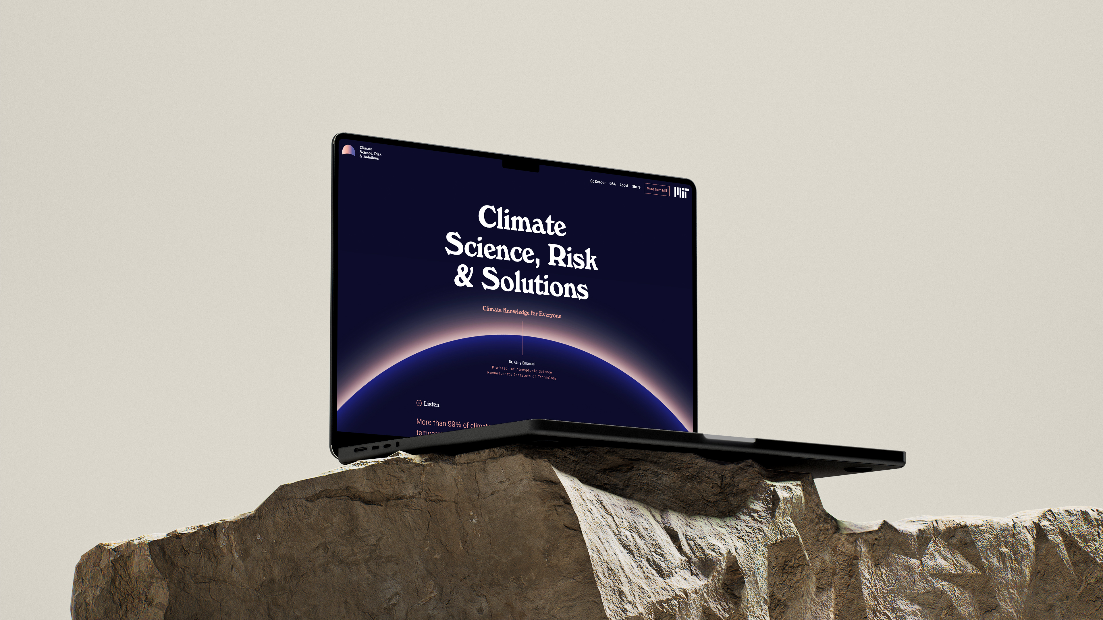
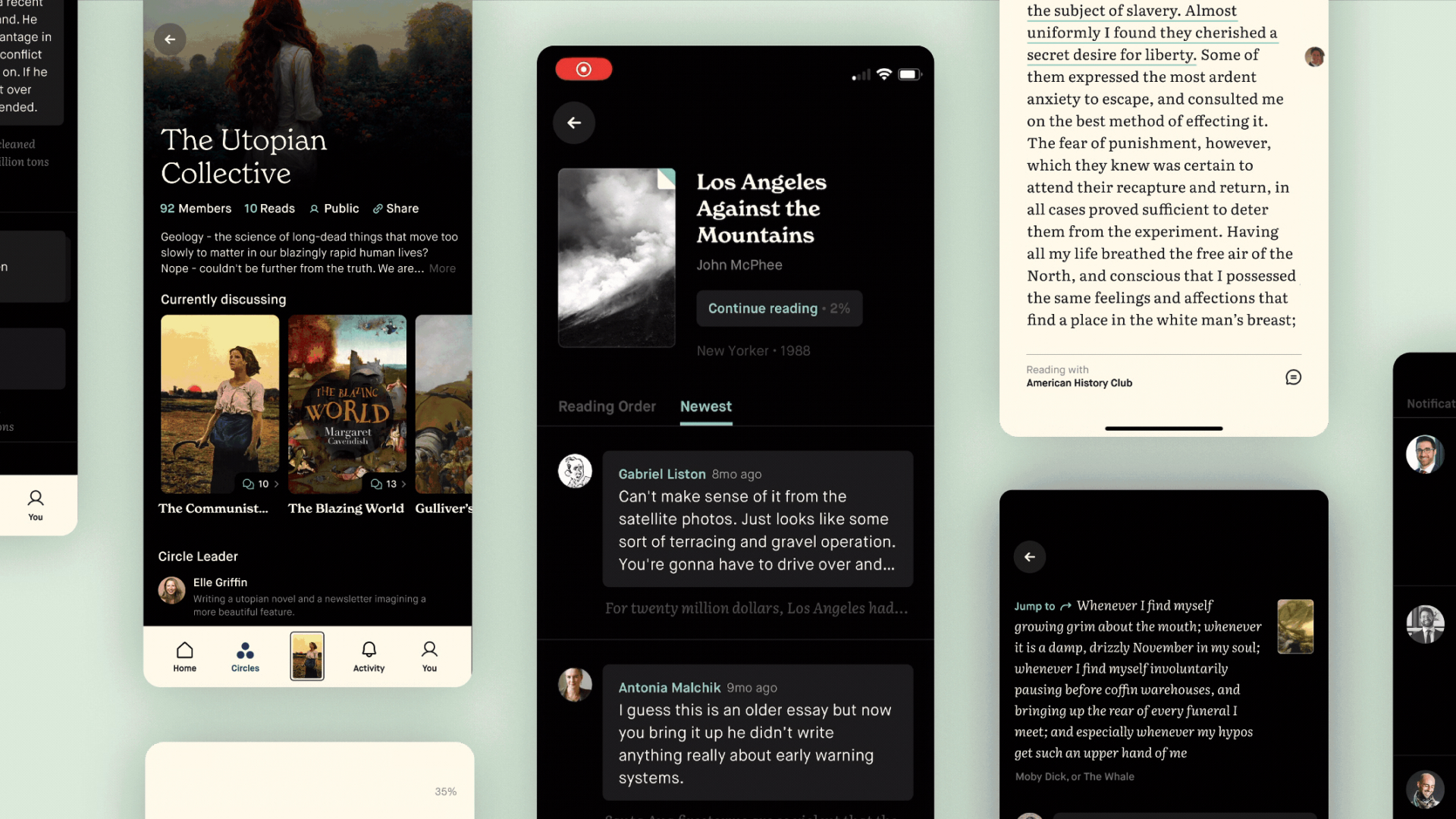
MIT’s Climate Primer
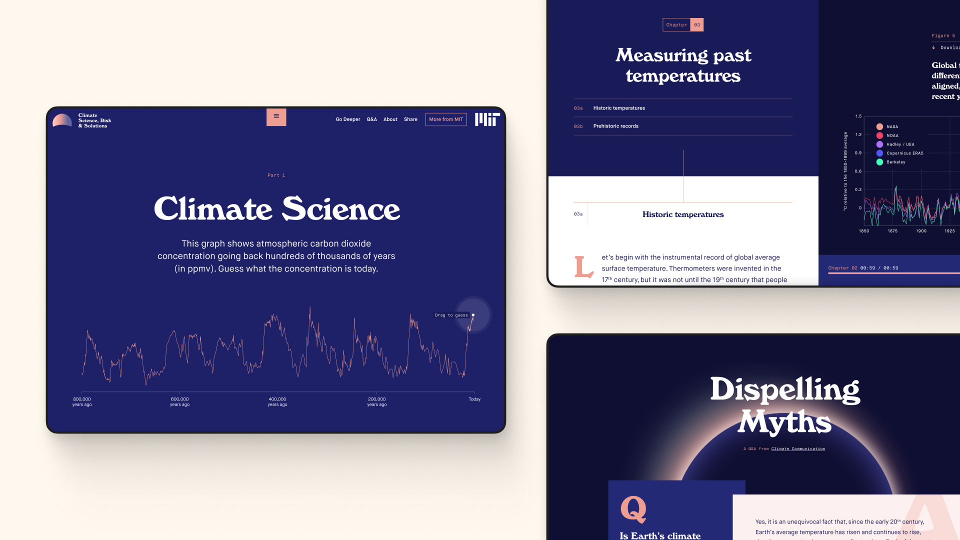
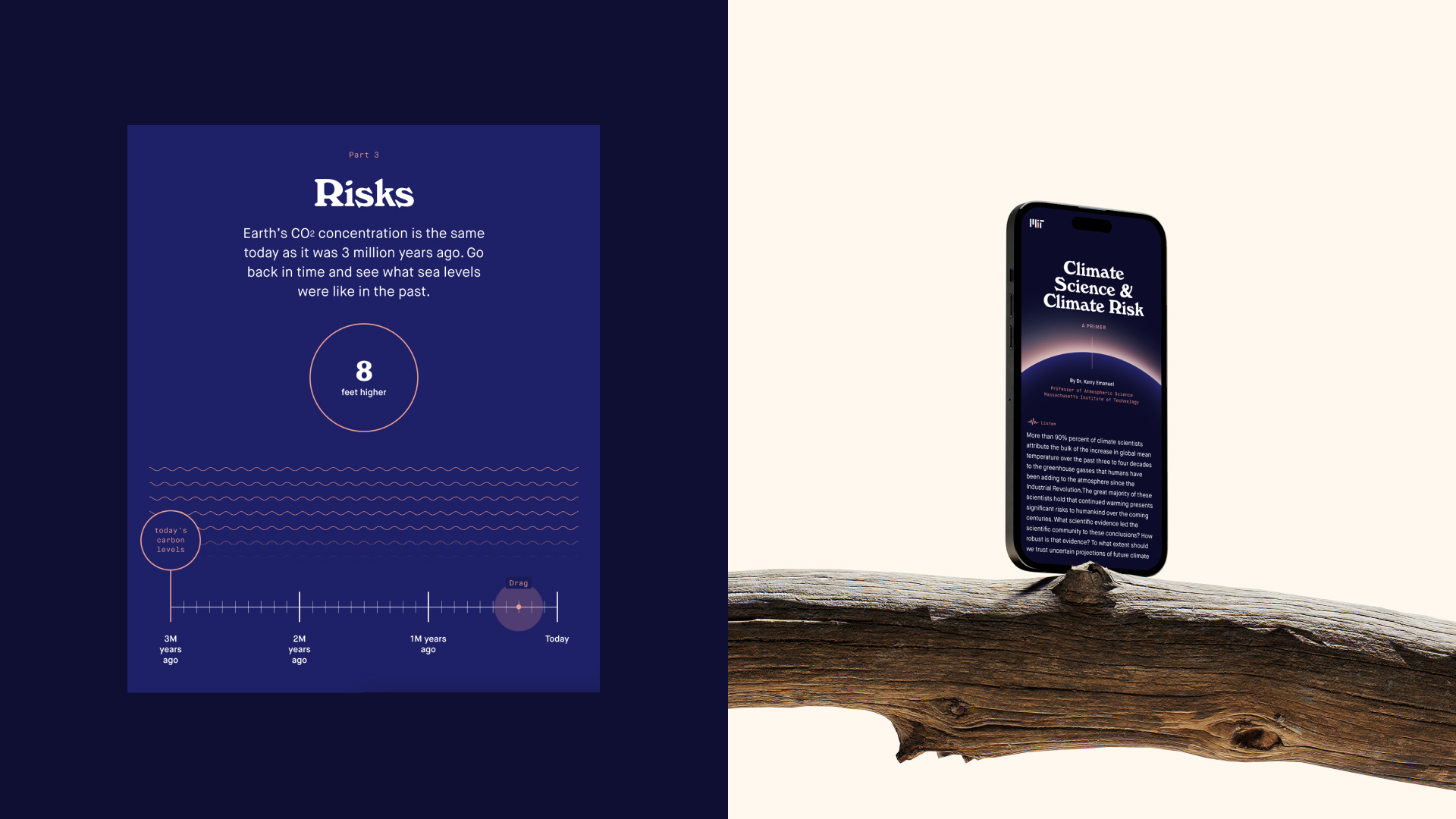
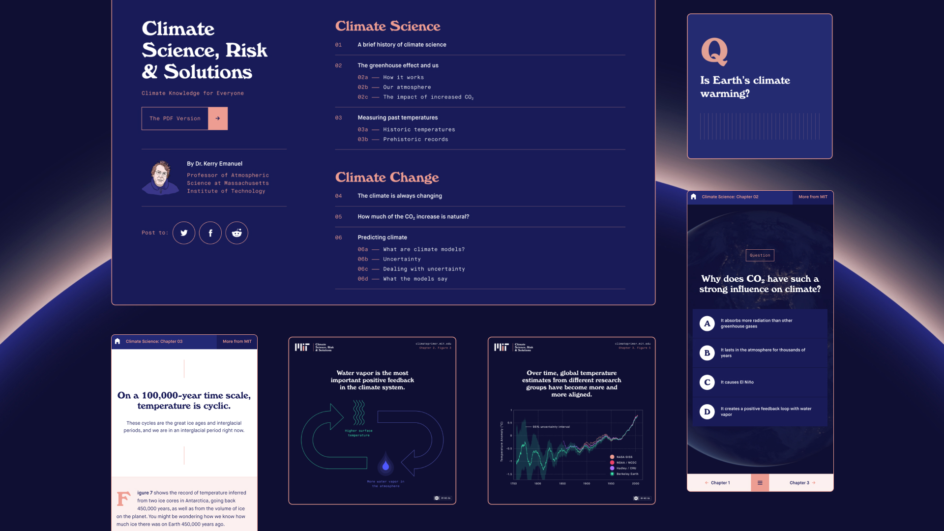
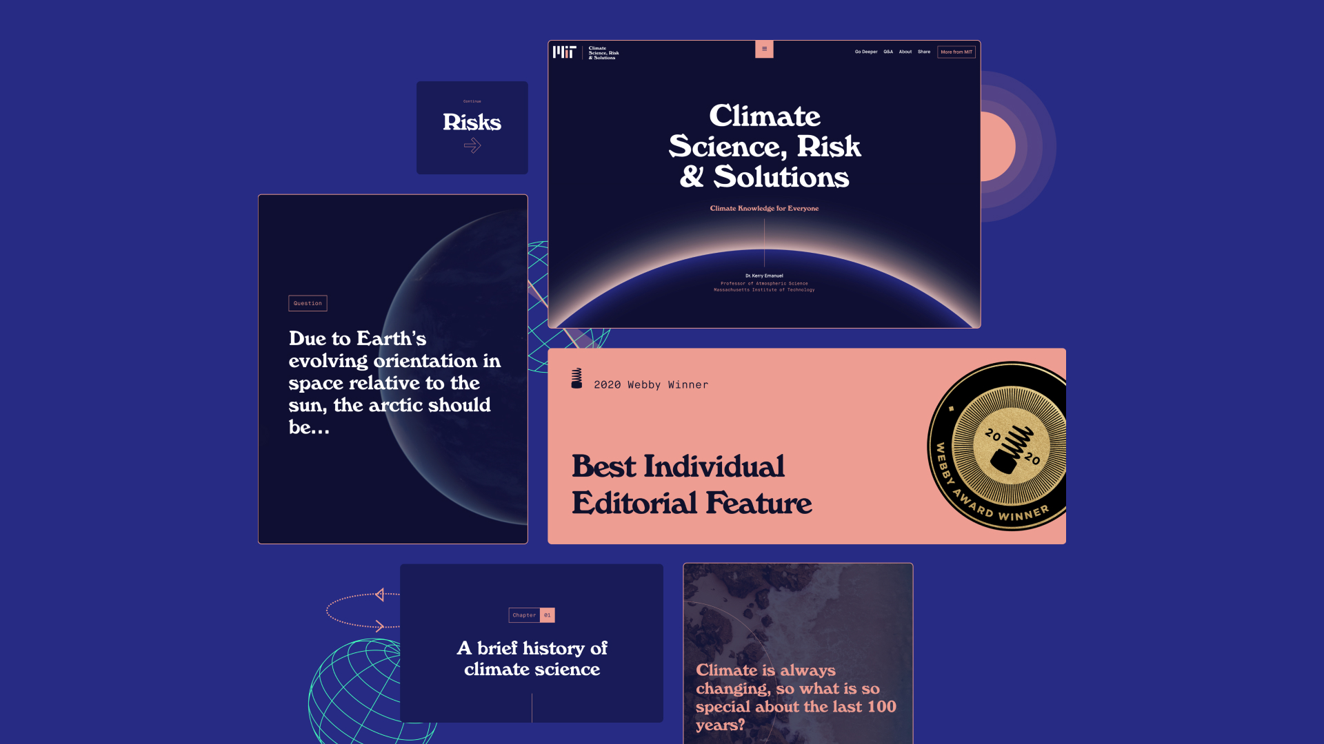
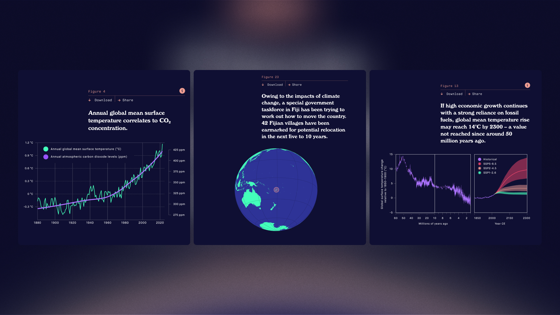
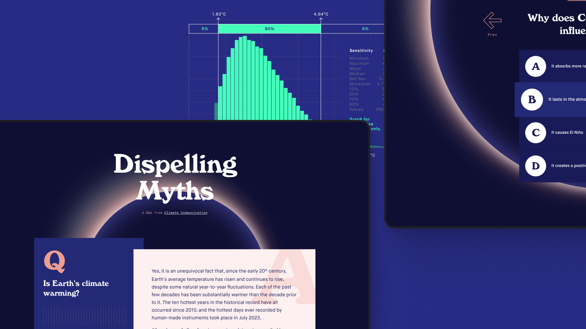
Context
MIT wanted their students, and the rest of the world, to understand key concepts of climate change. They had the information, but it was written for scientists, not the general public. My goal was to make this critical knowledge more accessible and engaging, and to prompt more nuanced conversations about climate risk management.
My role
I collaborated with MIT and the original author of the text to reimagine this story for a broader audience. I deconstructed the original text, edited it for clarity, and integrated interactive elements like animated graphs, diagrams, audio, video, and quizzes to cater to different learning styles. Working with two engineers at Upstatement, I helped build out the front-end too.
Outcome
This project helped establish MIT as a subject matter expert on climate change. The site demonstrated MIT’s expertise in online education, set a new bar for digital storytelling at MIT, and won a Webby Award for Best Individual Editorial Feature.
What I did
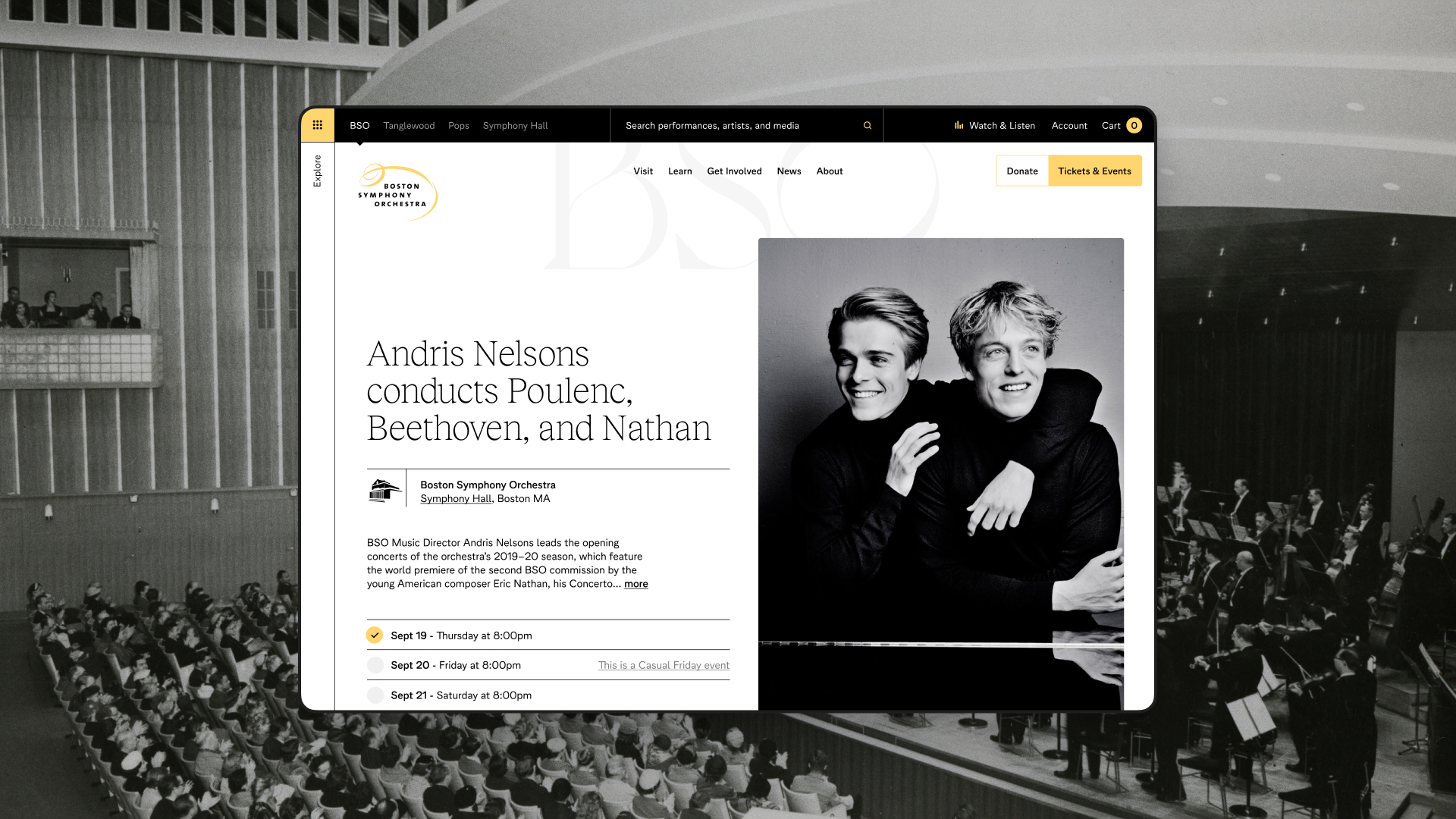
Boston Symphony Orchestra
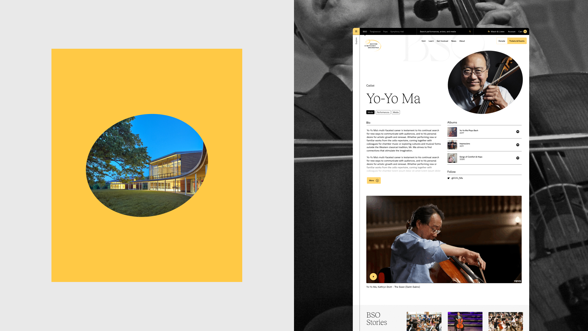
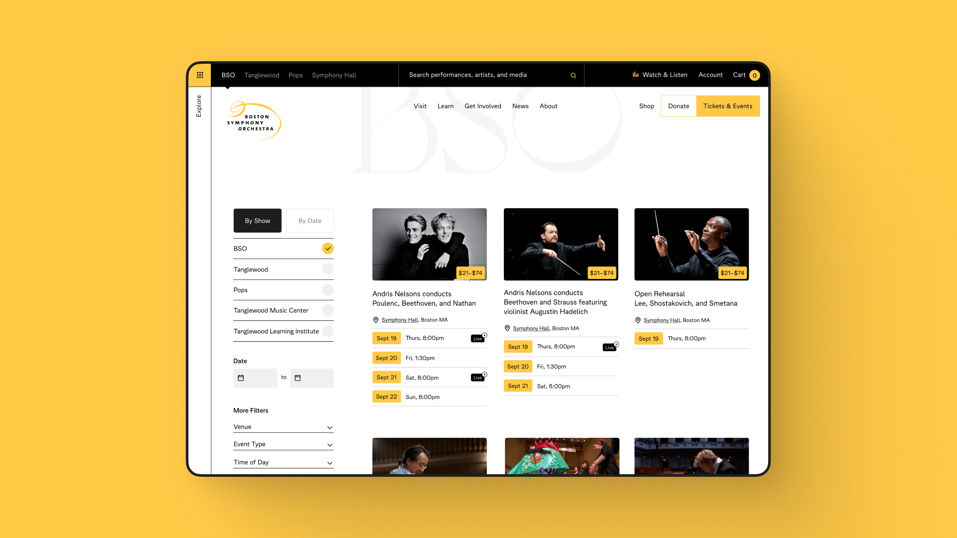
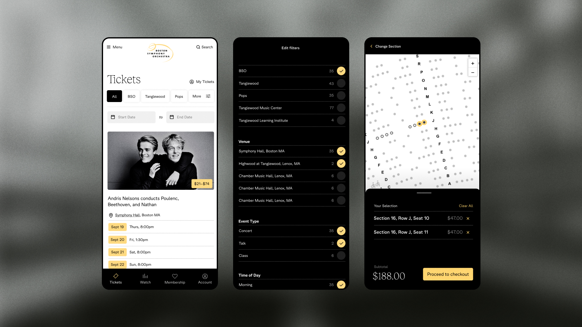
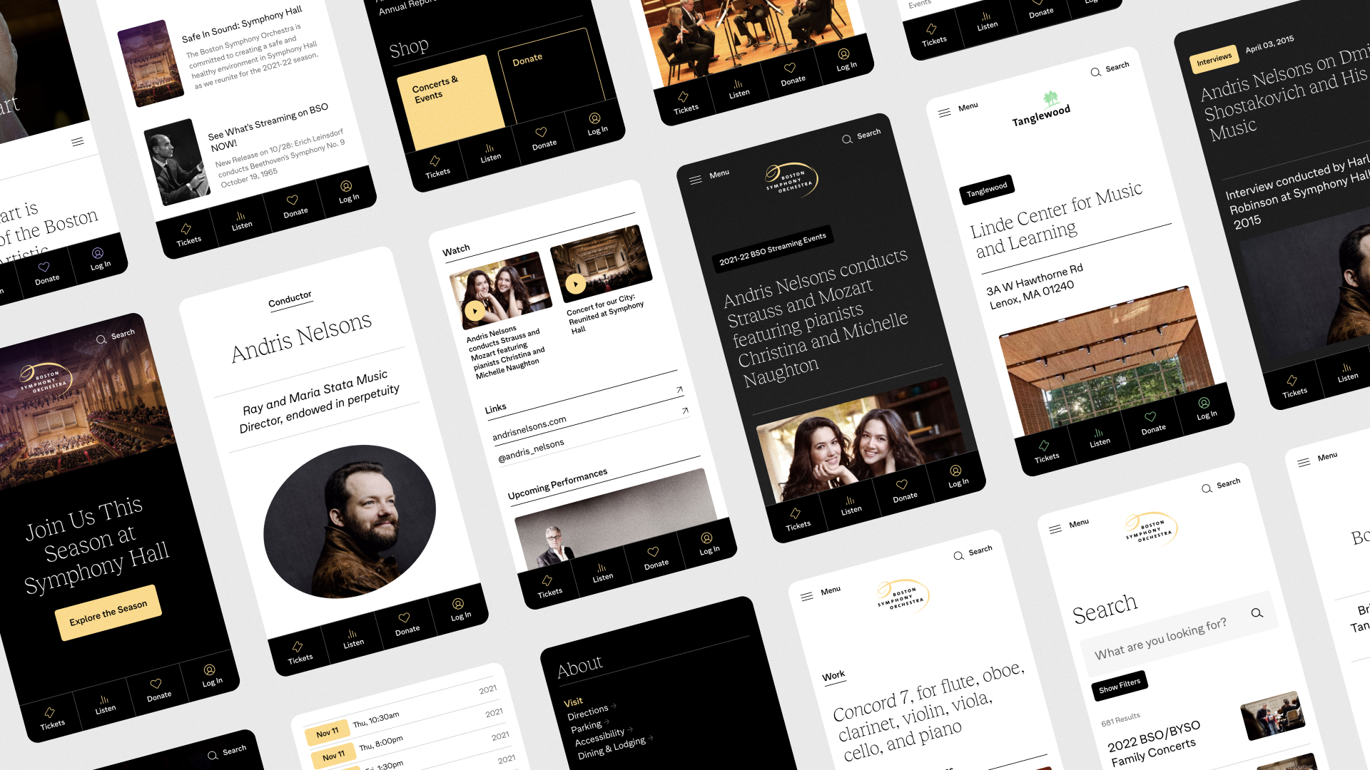
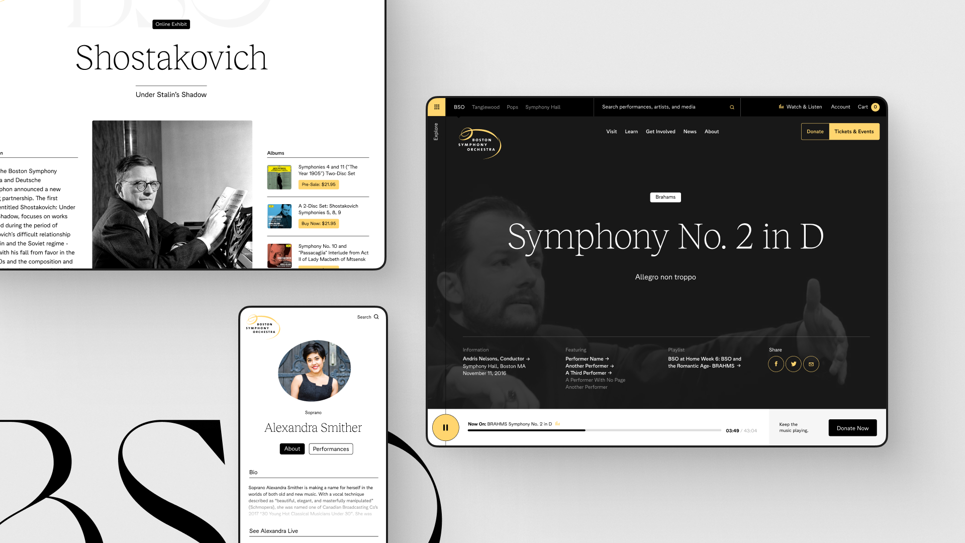
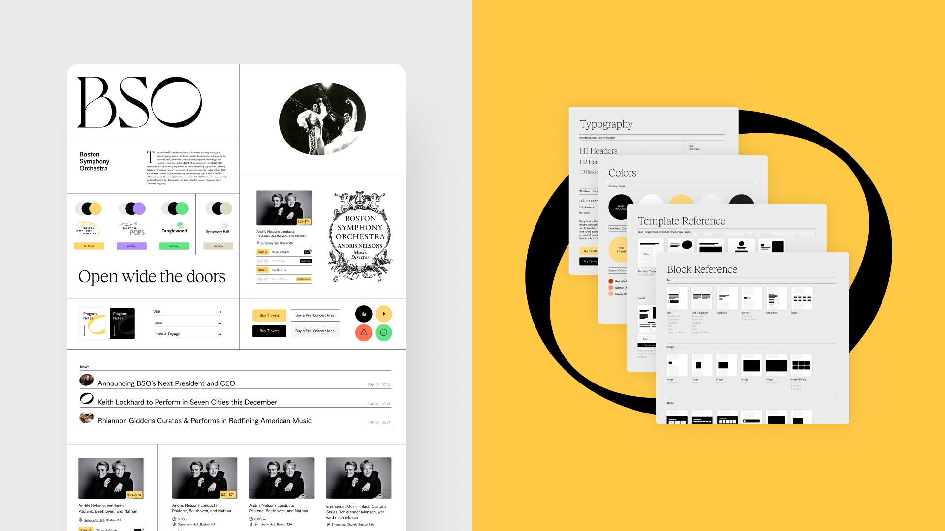
Context
This 140-year old institution needed to welcome new audiences and streamline internal publishing workflows. It was an infrastructure project in the truest sense: a ground-up rebuild of BSO’s digital systems, tools, and processes. The goal was to create a flexible, user-friendly platform that honored the institution’s legacy while setting it up for long-term digital success.
My role
I wore many hats on this project: strategist, designer, front-end engineer, and CMS engineer. I led the redesign effort from concept to launch, navigating complex internal politics and balancing input from a broad group of stakeholders. As a strategist, I defined project goals and translated them into clear technical and editorial requirements. As a designer and front-end engineer, I owned the visual system and wrote all site styles to ensure a cohesive, responsive user experience. On the CMS side, I worked closely with three other engineers to build the site in Craft CMS, structuring content in a way that made publishing fast, flexible, and intuitive. I also helped manage the project using an agile approach, keeping development focused and efficient.
Outcome
In just the first 3 months after launch, conversions were up 20%, site transactions were up 14%, and overall BSO revenue was up 4%. The project paid for itself within the first six months. One of the BSO content editors said that what used to take days now took minutes in their new CMS. The BSO has since undergone a rebrand, which compromised the integrity of the original design. Still, they kept our front- and back-end architecture firmly in place — a testament to the durability and flexibility of the system.
What I did
Even more...
After two decades in design, not everything fits neatly into a case study. From startups to agencies to global brands, I’ve seen it all.
Some of these projects shipped, some shaped teams, and some quietly disappeared. Here are a few of my recent favorites.